Location: 1067 Budapest, Oktogon 2.
Client: K&H Csoport
Scale: 1.500 m2
Architecture & Interior: LAB5 architects - Linda Erdélyi, András Dobos, Balázs Csaba Korényi, Virág Anna Gáspár
Project Architect: Dóra Melis-Seenger
Designers: Anna Beketova, Bercel Dózsa, Diána Németh, Eszter Macsuga, Dávid, Páncsics, Réka Petrics, Barnabás Rácz-Szabó, Dávid Székely, Guangrui Wang
General Architecture & Civil Engineering: Tetraterv, István Szabó
Heritage Protection: Ferenc Bor, Tímea Tóth
Landscape Design: Lelkes Kertész, János Kiss
Light Design: Lighting Embassy - Solinfo
Details: epszerk.hu, Károly Nagy
Mechanical: Premium Épületgépész, Tamás Tirpák, Zoltán Csaba Rácz
Electrical Engineer: VBL, Balázs Vados
Weak Current Systems: Velox, István Nagy
Fire Safety: Fireeng, György Decsi, Marcell Matusek
Acoustics: AQrate, Andor Fürjes
Flower Composition: Atakpelif Floral Expeditions, Kata Filep
Survey: A-Ponton, Sándor Kovács
BoQ: Ferenc Schneider
Elevators: Schindler Hungária Kft, Ferenc Gróf
Project Management: K&H, Tamás Annus
Photography: Zsolt Batár
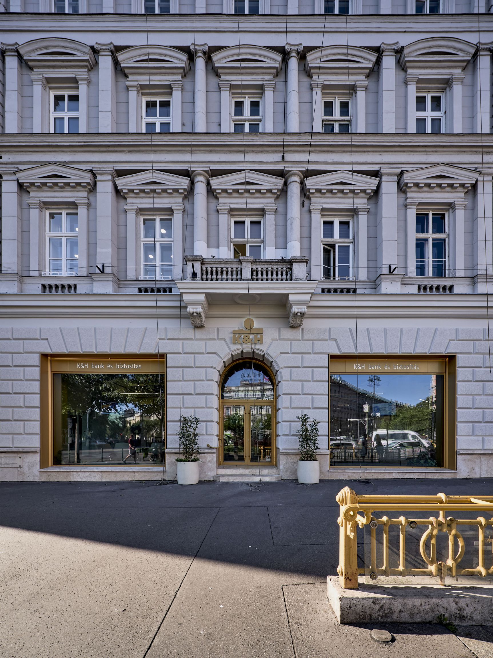
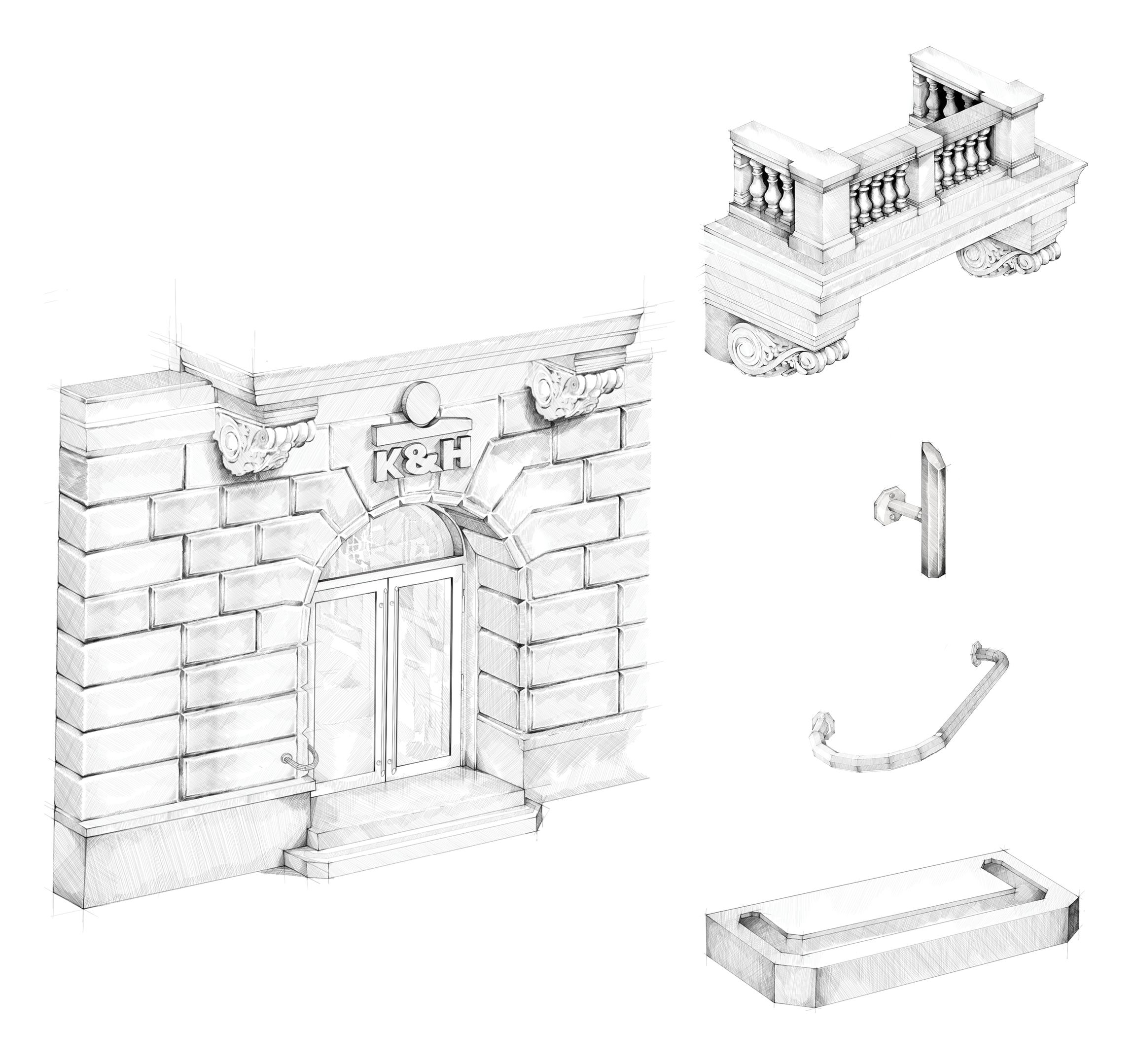
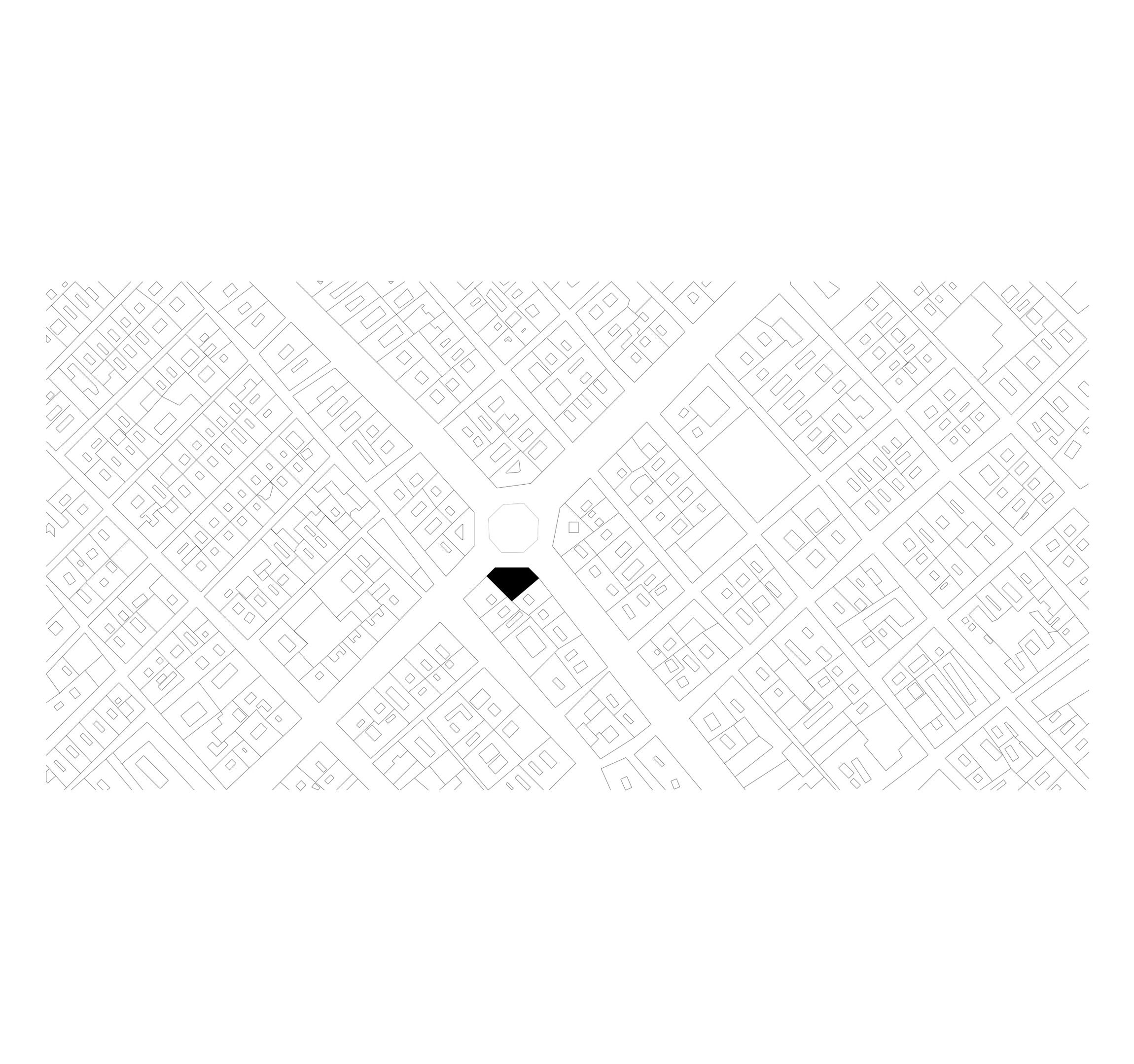
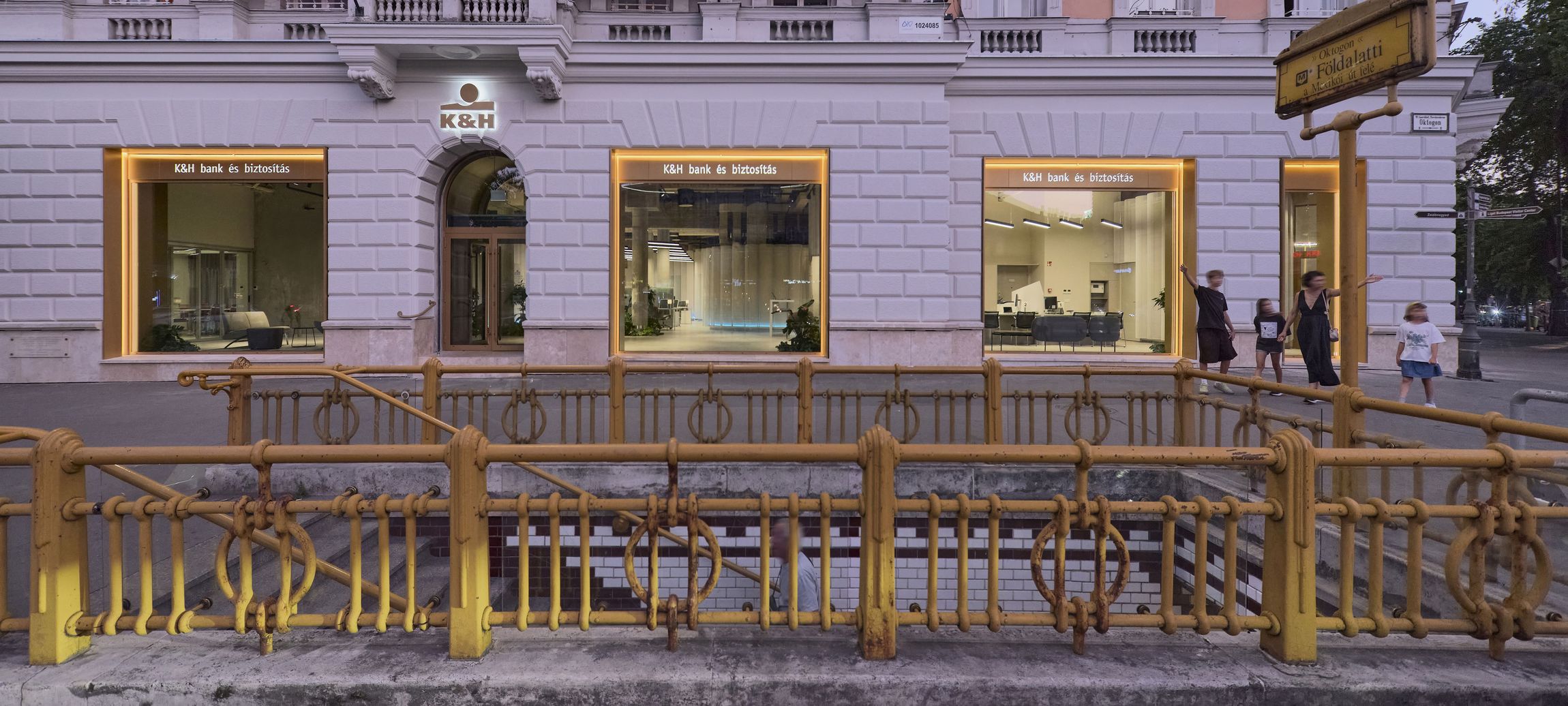
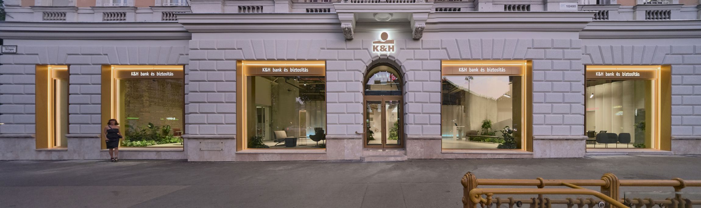
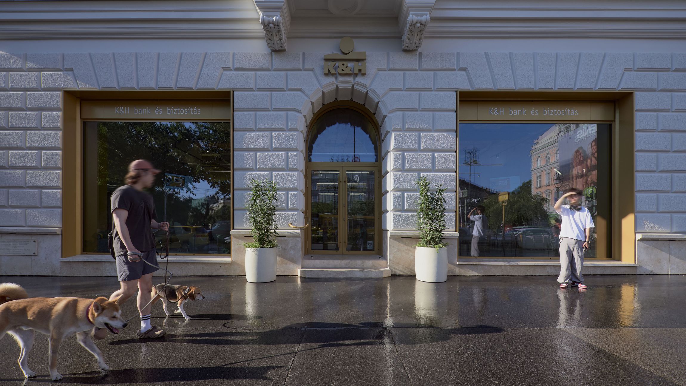
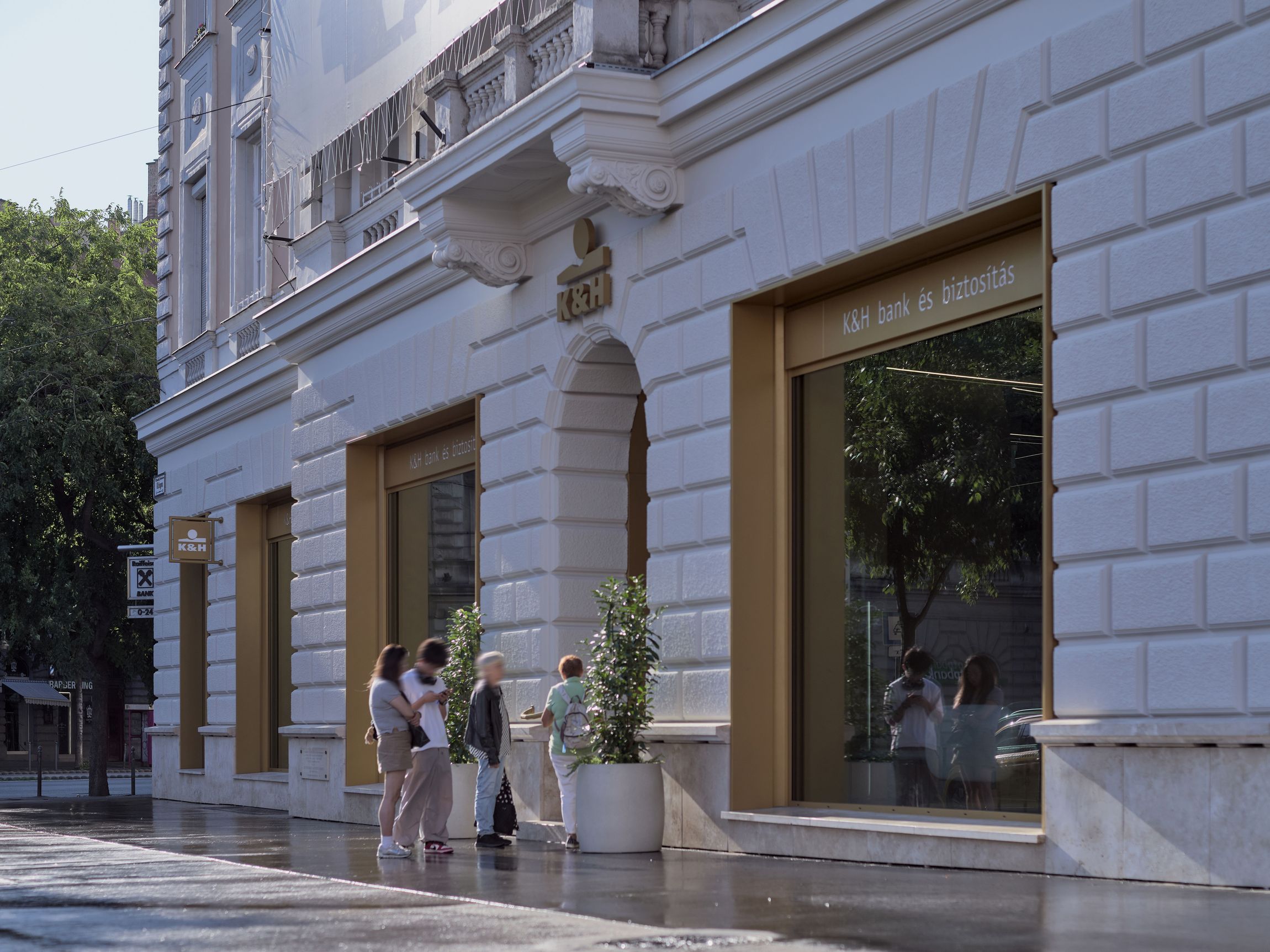
Oktogon is an important square in downtown Budapest, shaped in a classical way and being part of the composition of the prestigious Andrássy avenue. The four sides of the octagonal shape are formed by identical houses, created at once by the same architect.
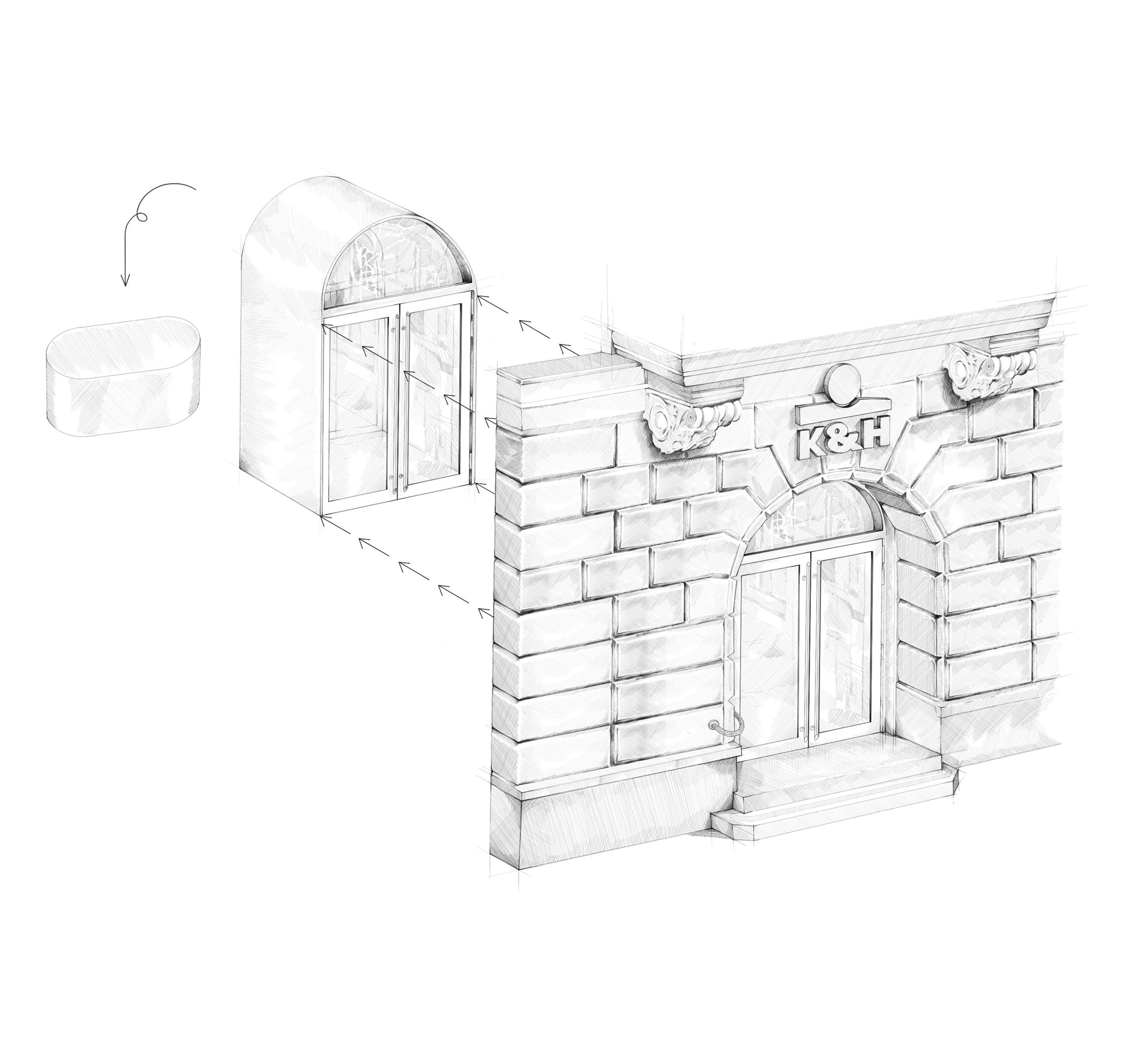
Today, the ground floor of one of the corners is occupied by the bank branch K&H nowadays. But 150 years ago, it was the space of the most well-known coffee place of its times, called Abbazia.
...Read more
They were notable because of their exceptional clientele; famous journalists, painters, architects and writers lived their social and professional life around the tables. The interior was made of the highest standard, filled with fine and modest furnishing. It had the biggest Venetian mirror of the Austro-Hungarian Monarchy, and the space was decorated with Southern plants evoking the atmosphere of the seashore whose name originated the name of the place. Due to the success of the enterprise, they were constantly growing, occupying even the courtyard, and the former main entrance of the residential building.
During communistic times social life shifted from public spaces to private ones, and coffee places become somewhat called espressos, with different goals and interiors. All these changes meant interventions not only on the decorations, but also on the structure and the façade. Beside these functional motivations, another big intervention happened during the 1956 anti-communistic revolution, the building was hit by a cannon from a tank.
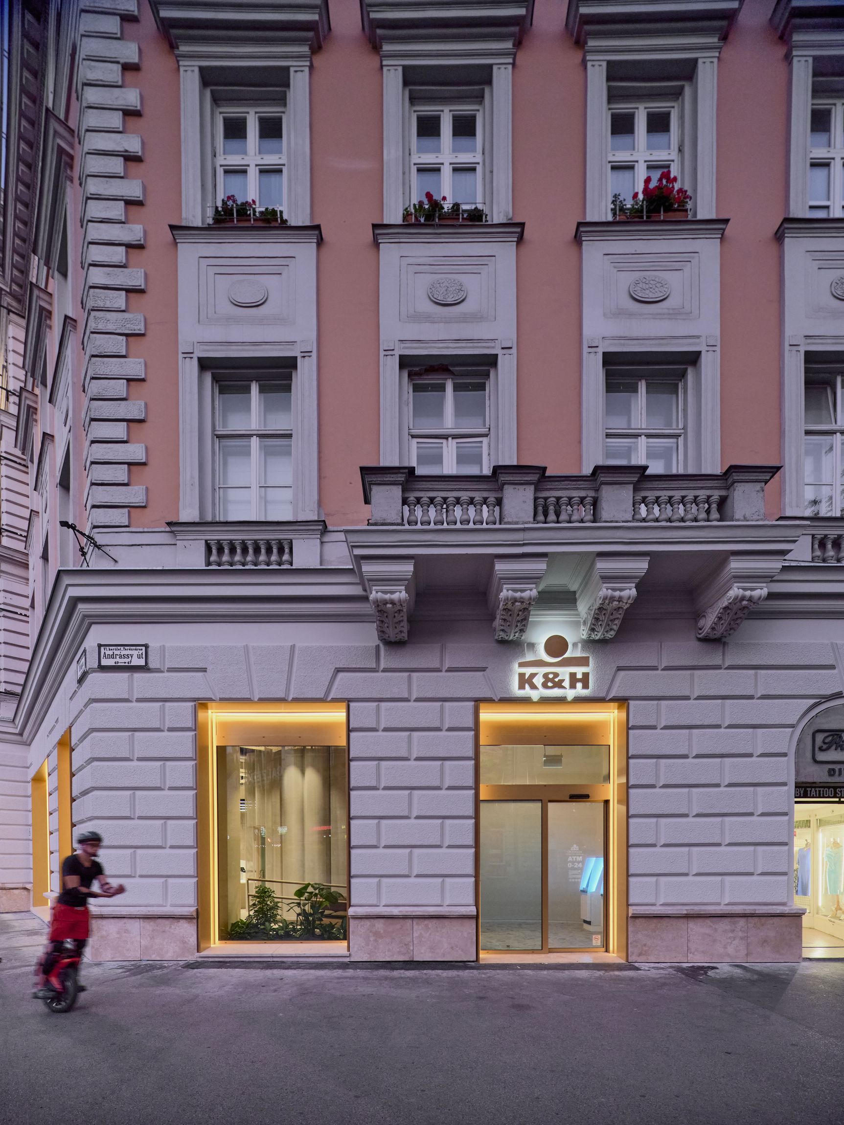
In 1990 came the change of the times, K&H Group purchased the premises and opened their biggest bank branch in the city. Today they decided to undergo a mayor refurbishment. The way we do banking, and the way we are using these spaces, changed a lot during the last decade, and it is hard to exactly predict how we are going to use them in the next 30 years.
K&H Group was looking for a concept that is not only fresh but also futureproof. A layout that is serving today’s demand, but leaves room for changes. A look, that features the classic past of the building, but also attracts younger clienteles. Inviting, open, transparent. Official and trustable, but cozy and friendly at the same time.
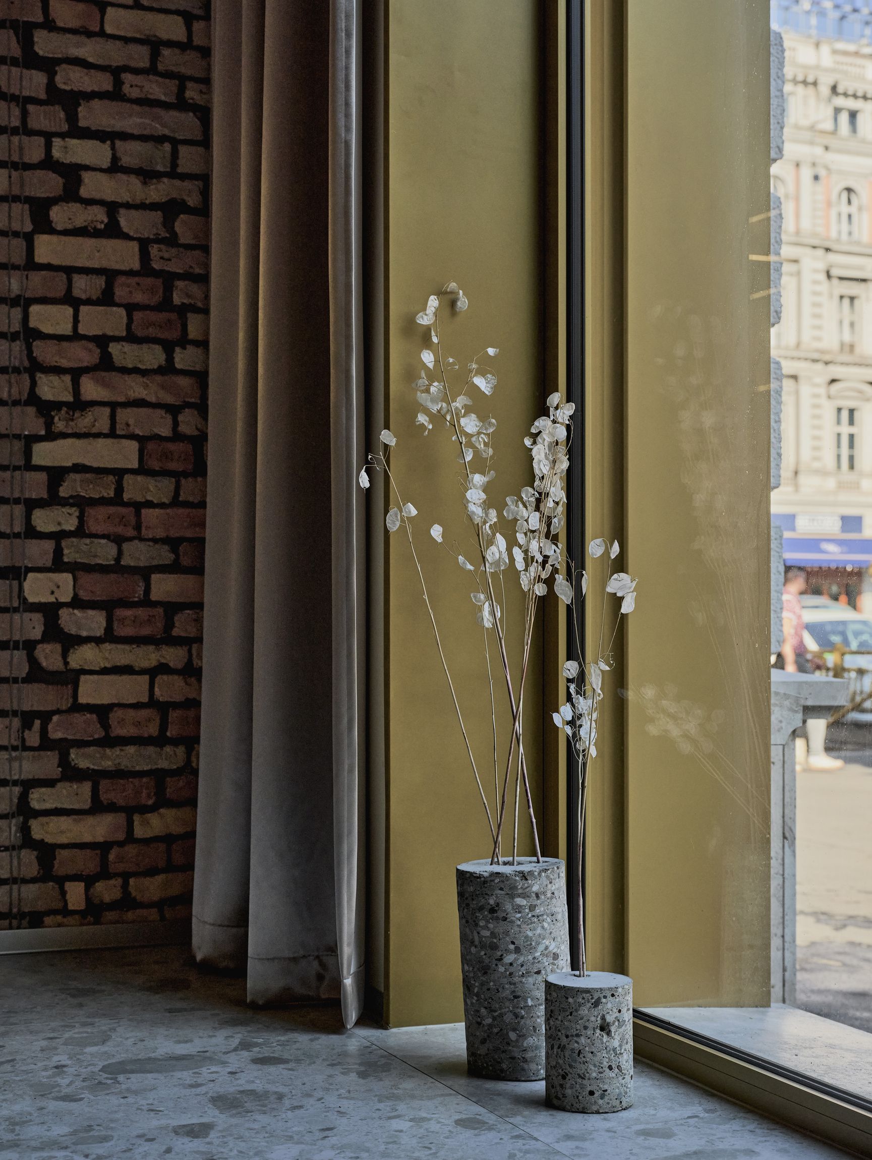
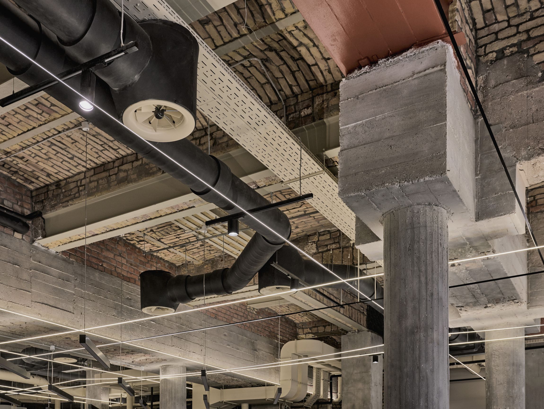
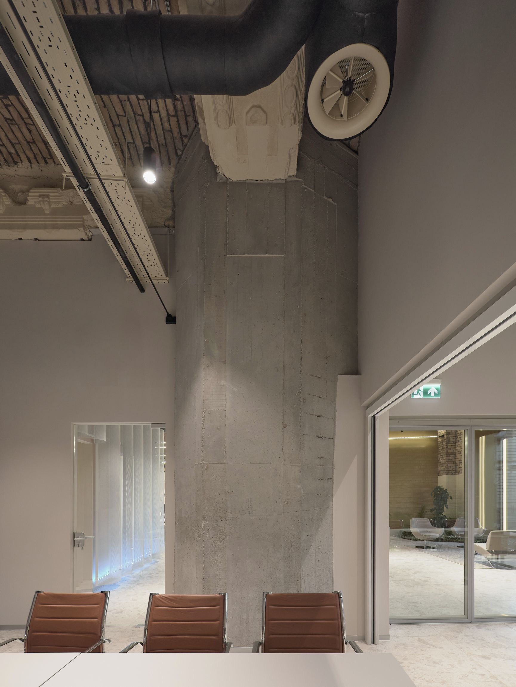
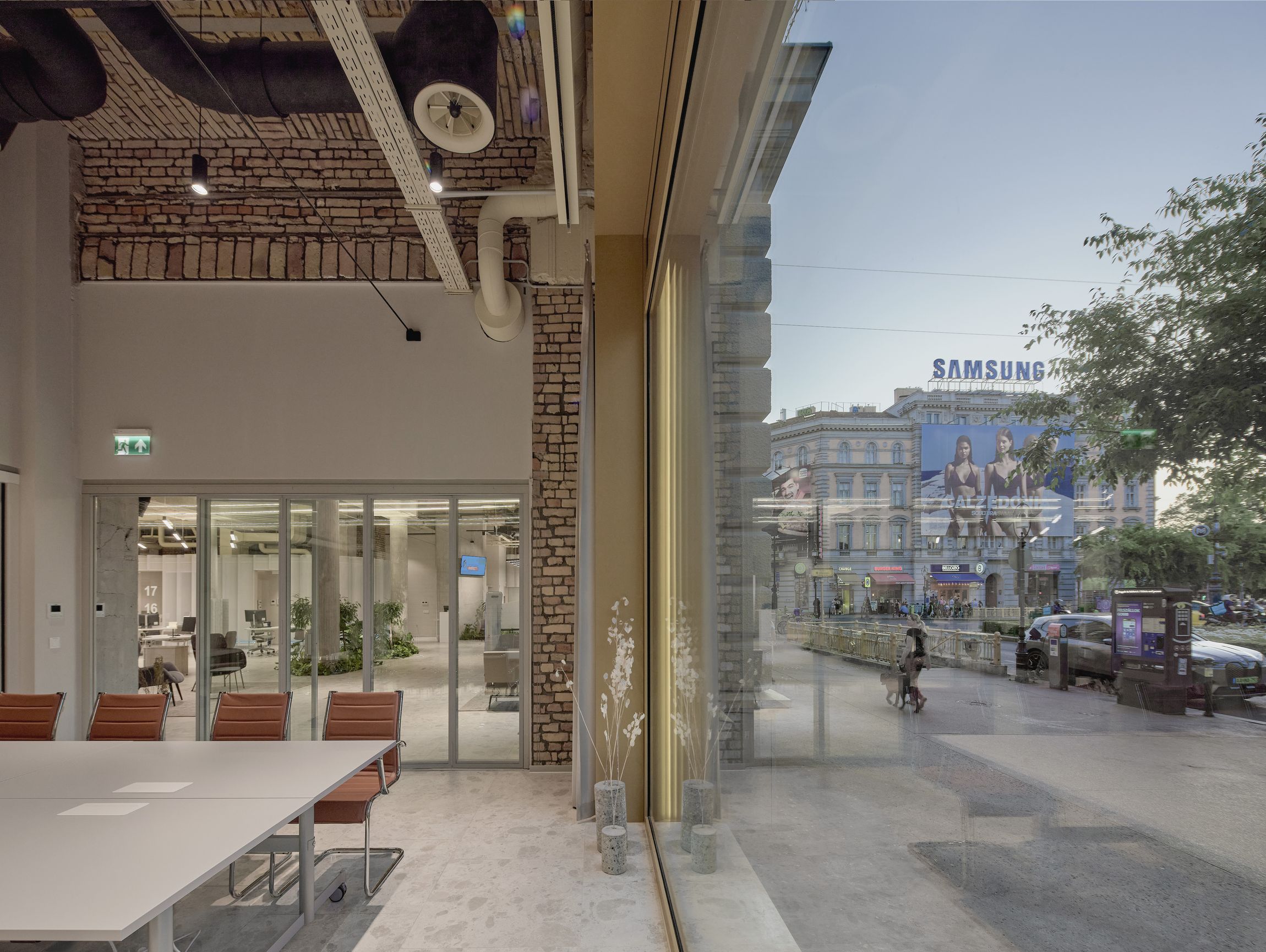
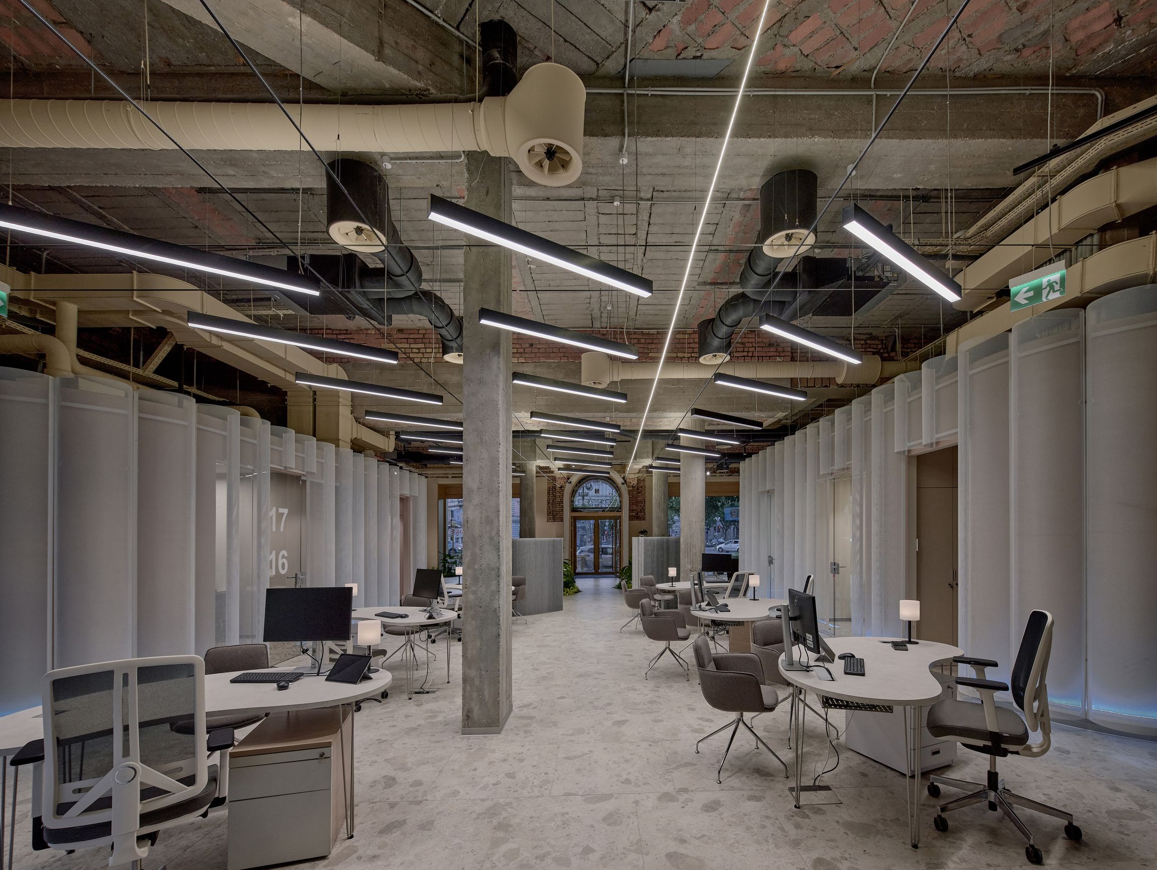
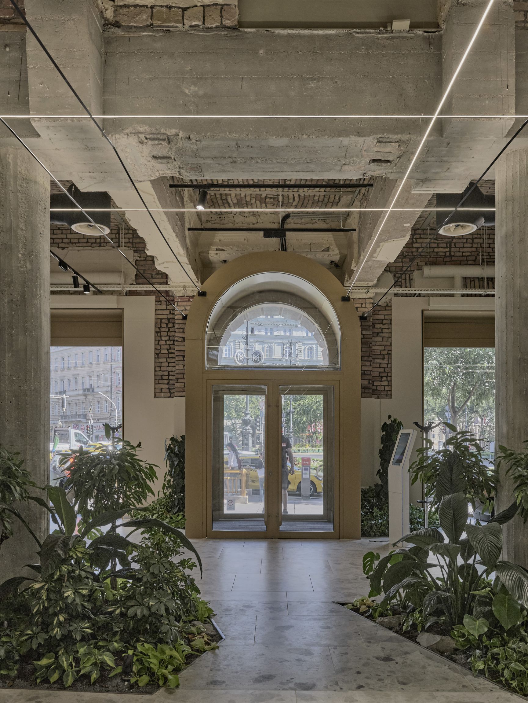
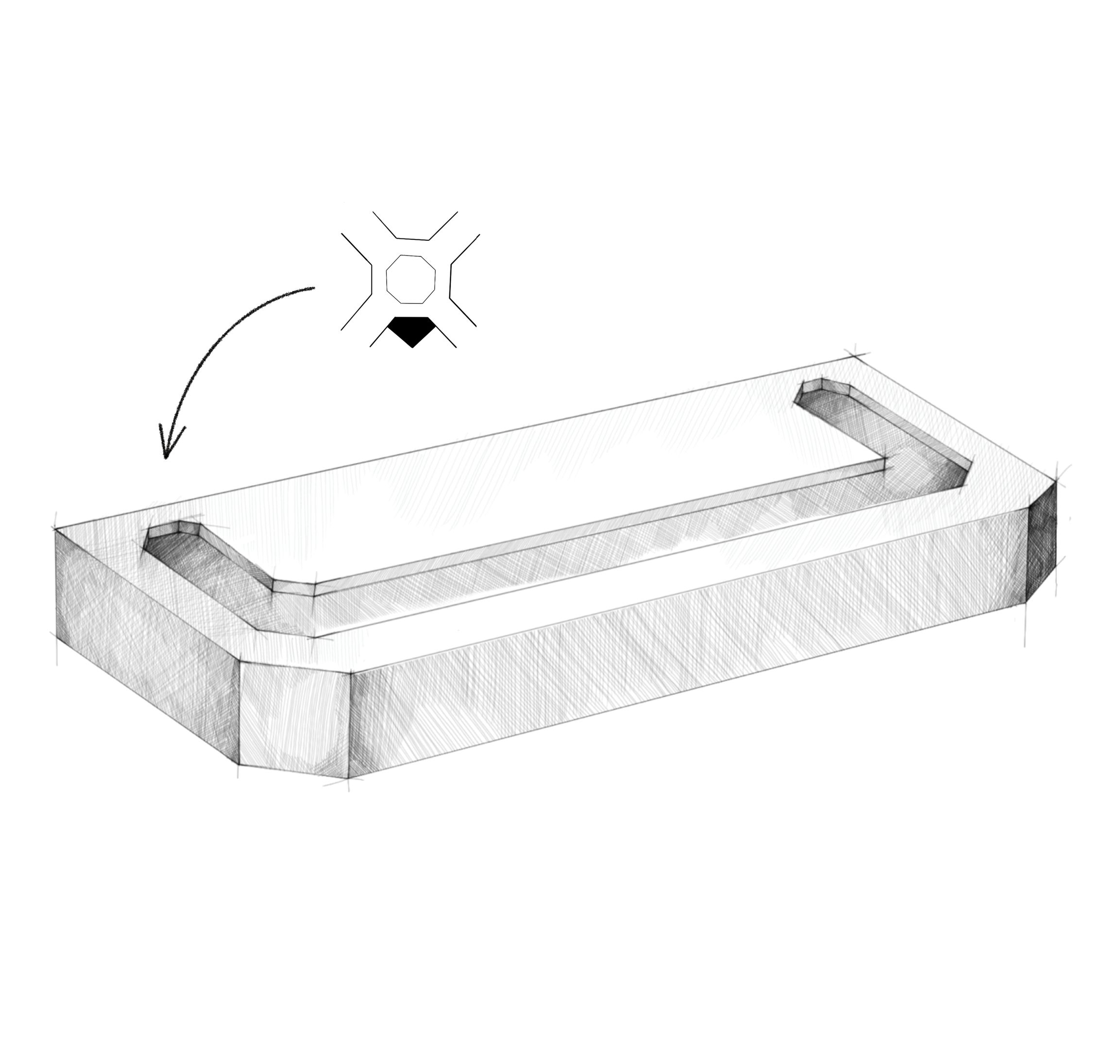
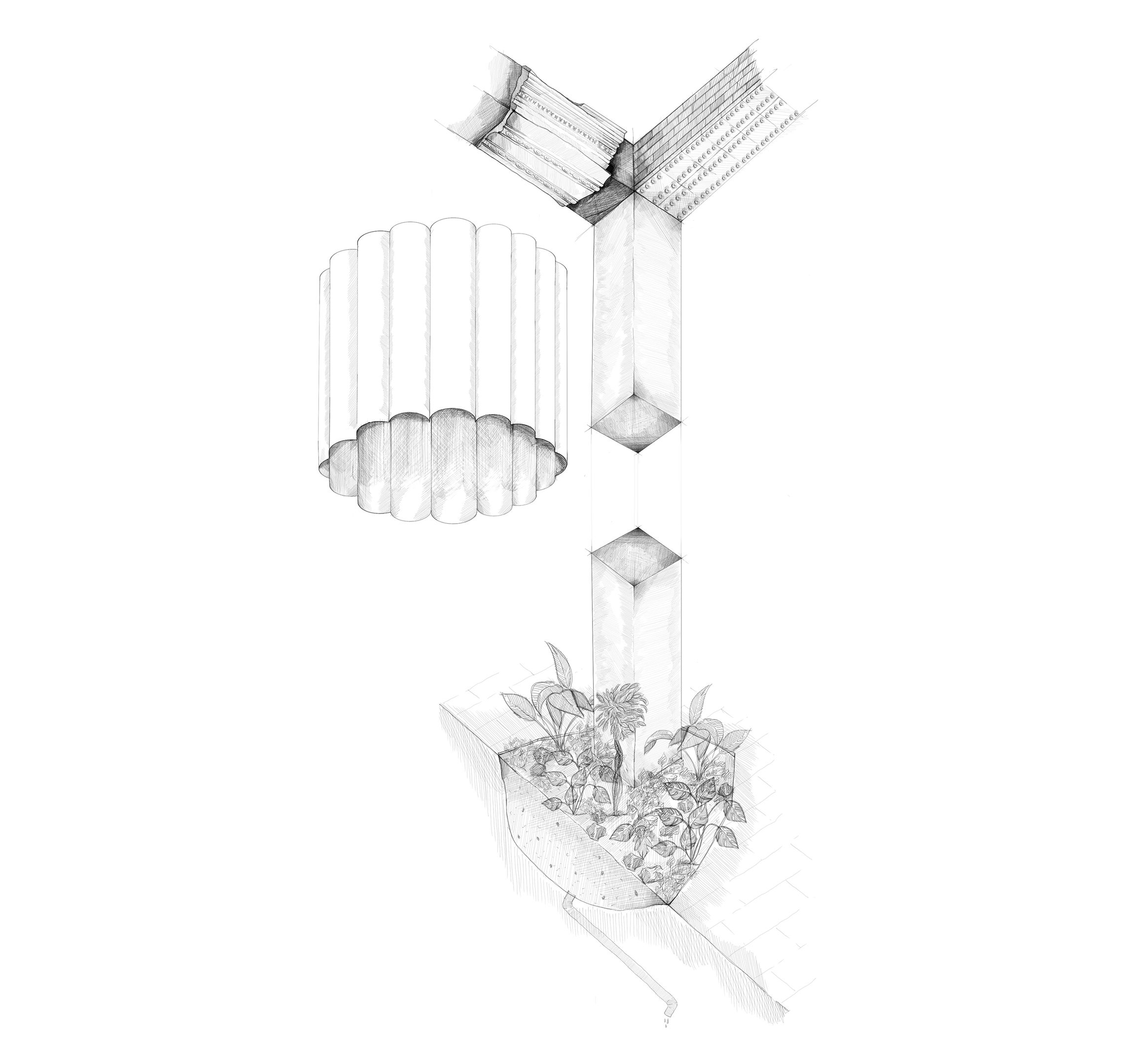
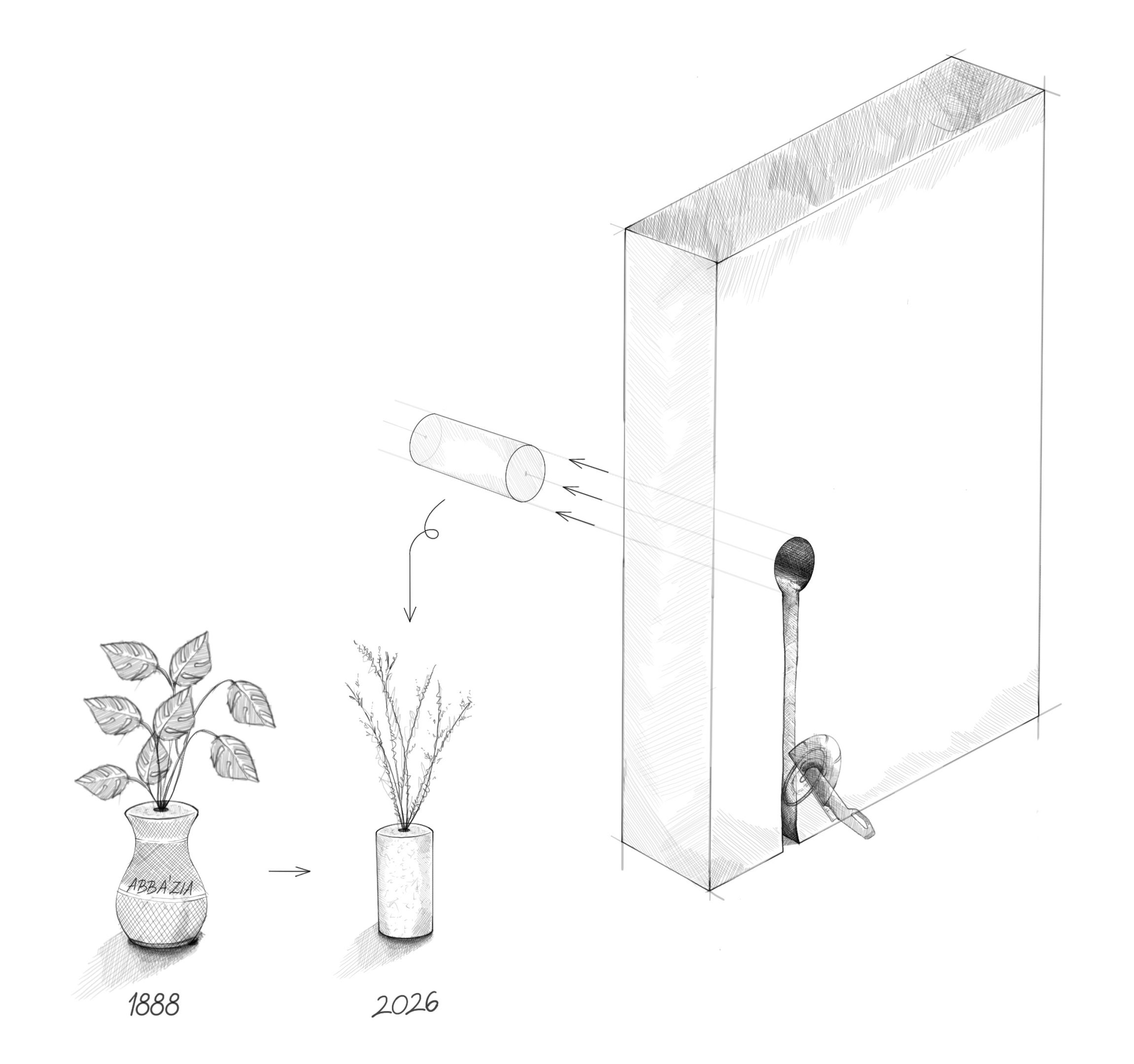
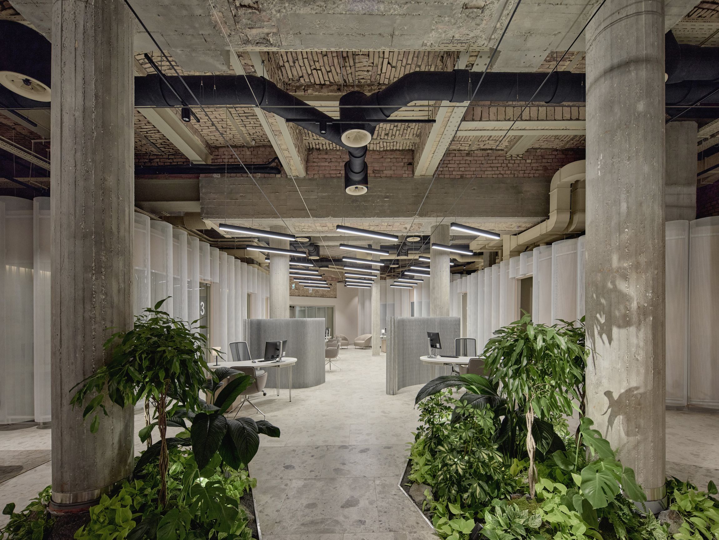
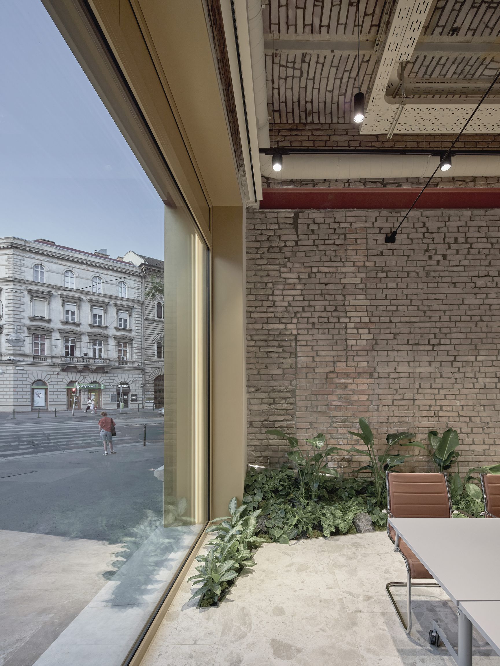
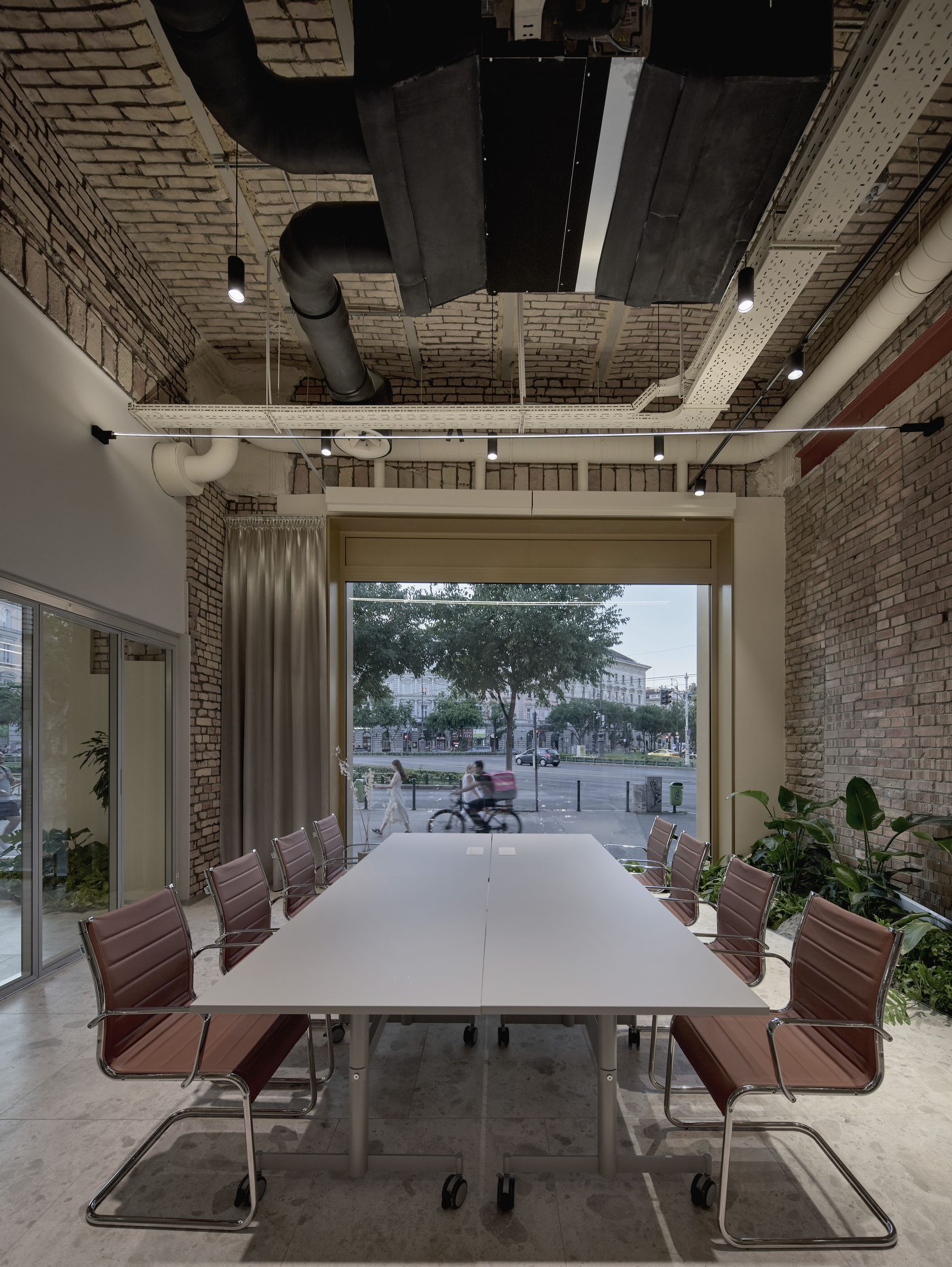
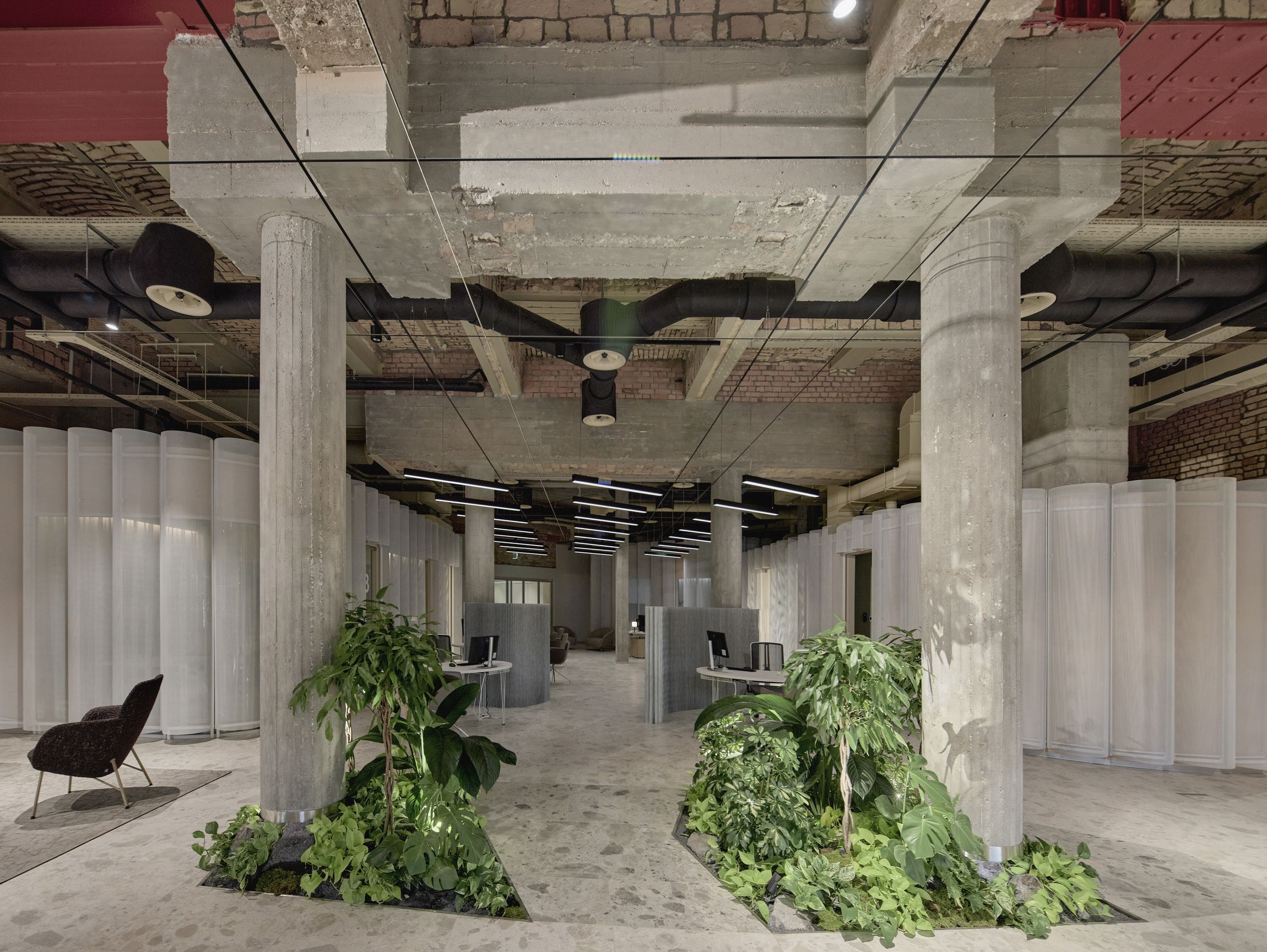
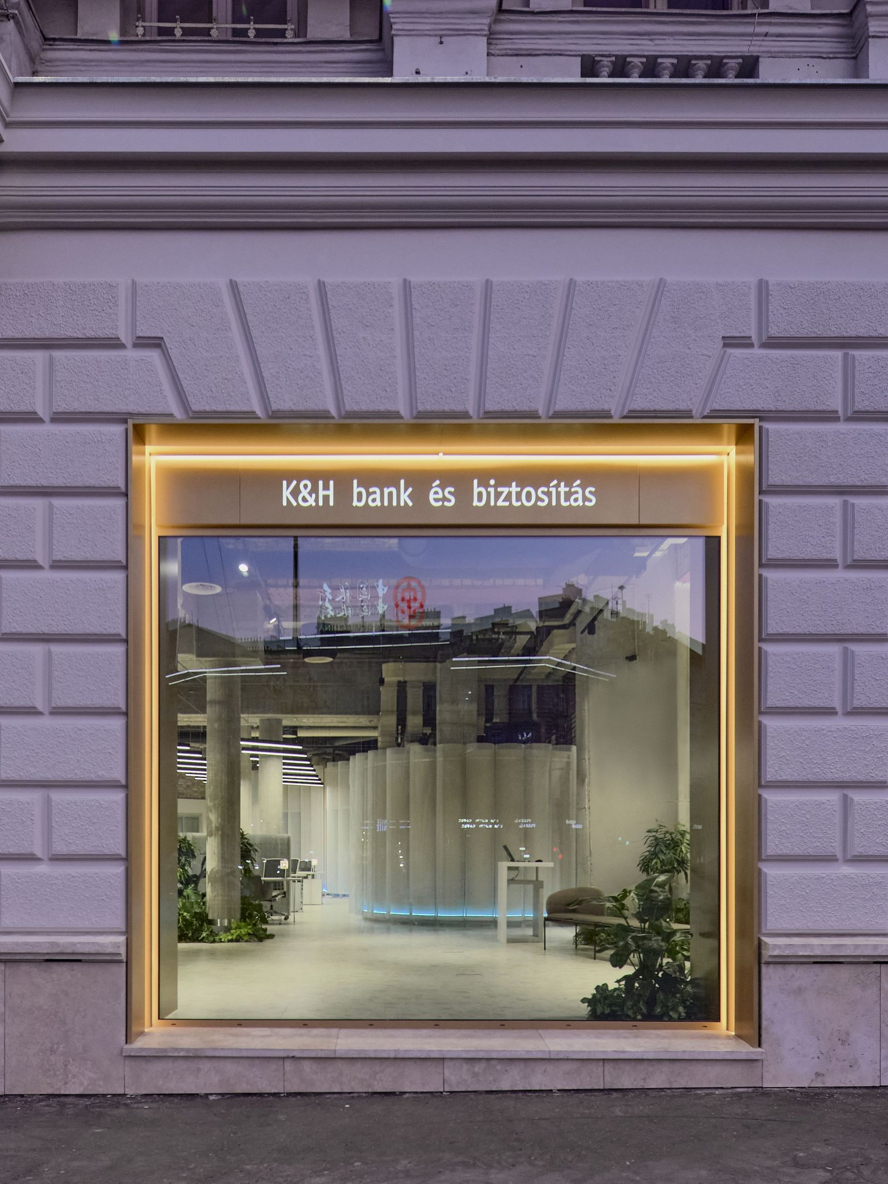
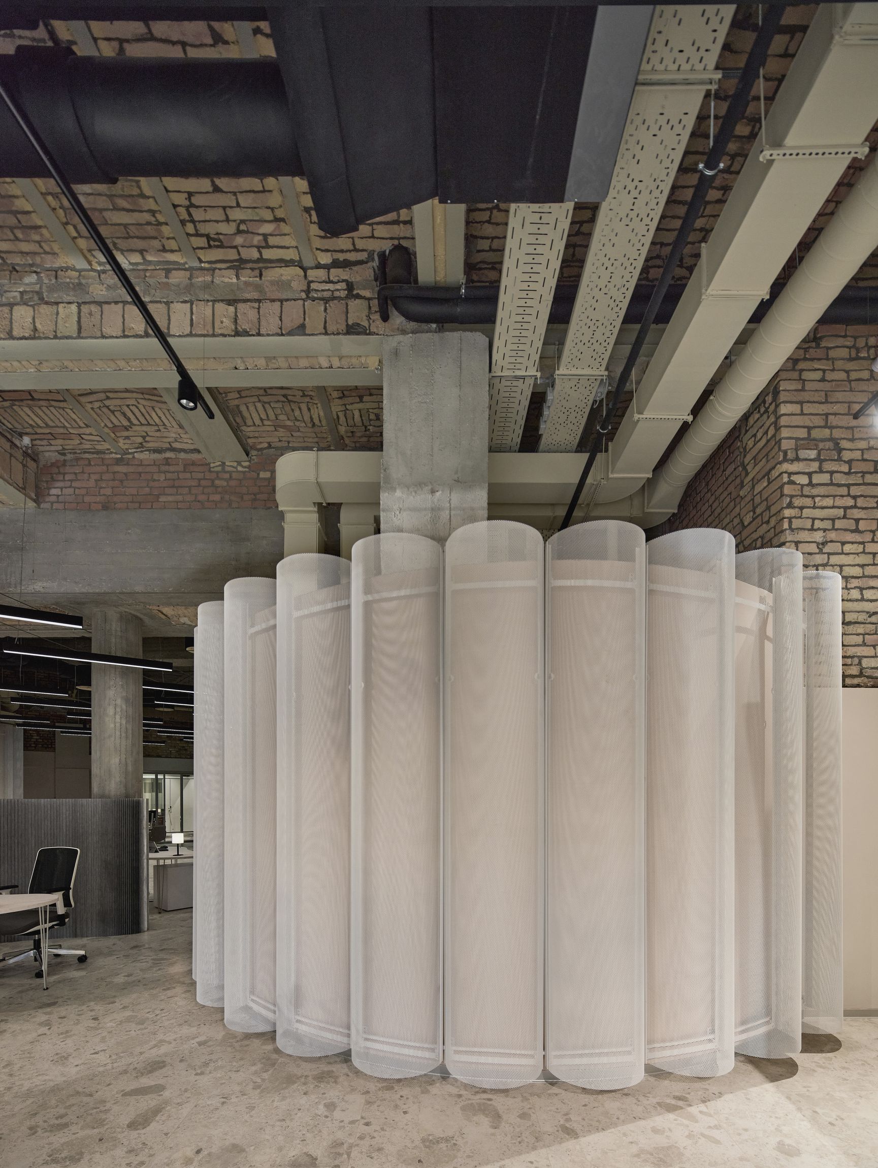
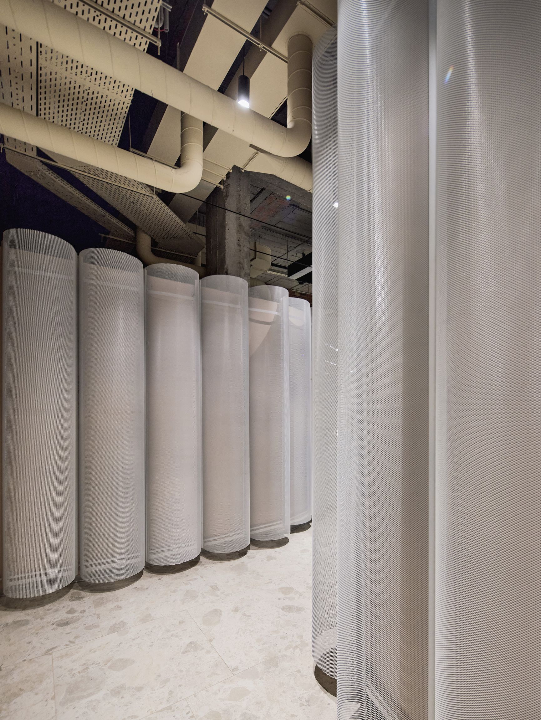
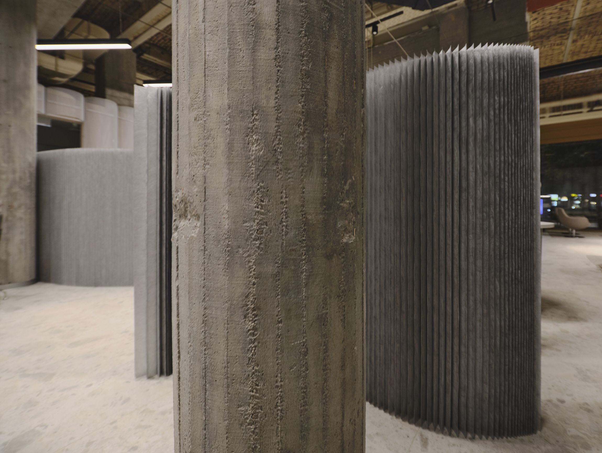
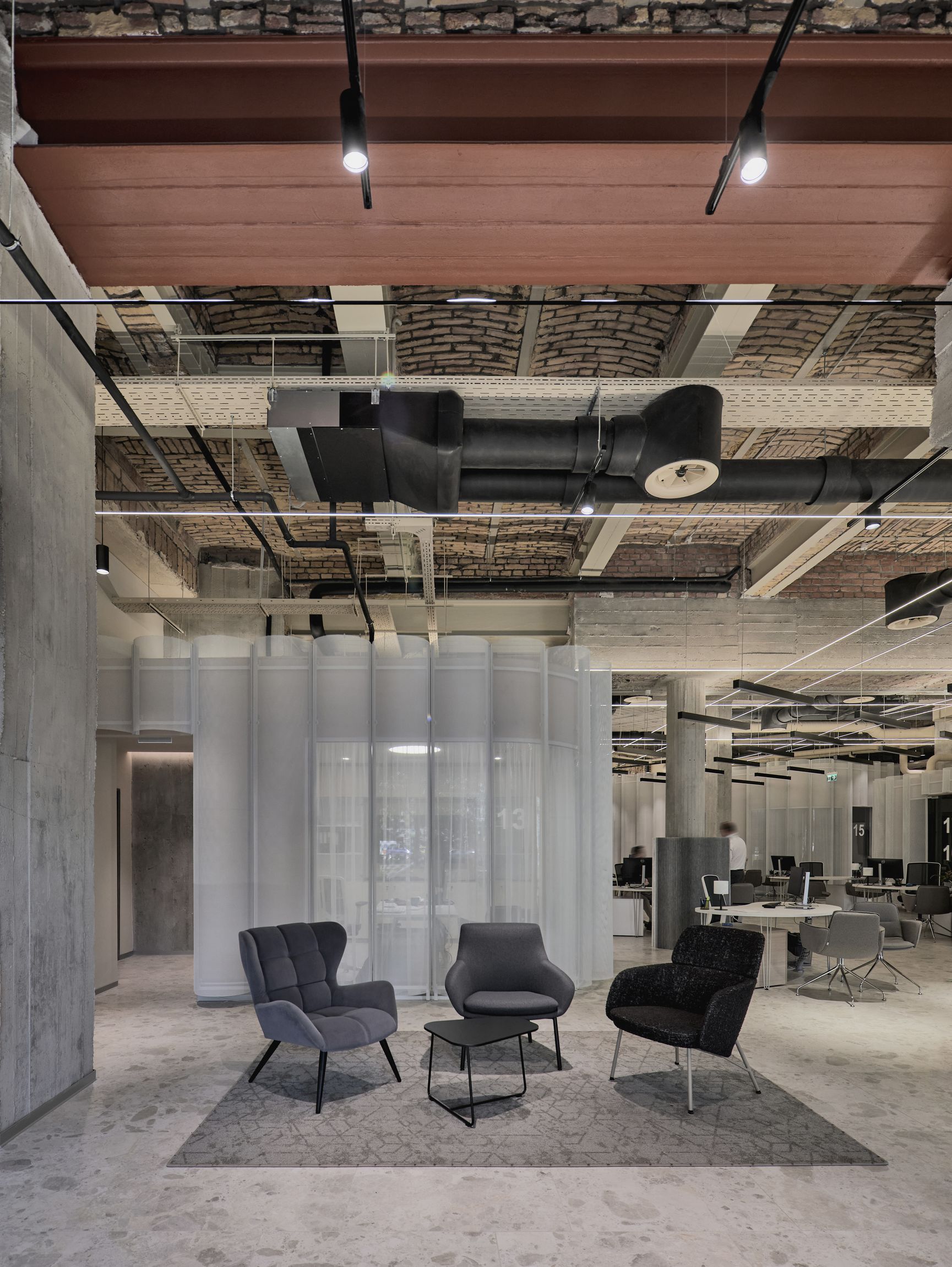
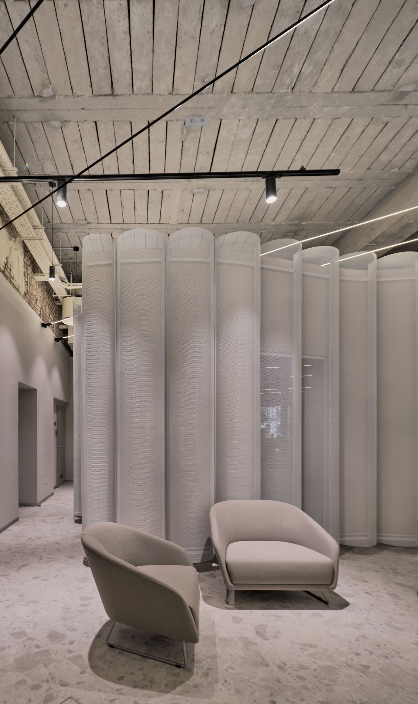
LAB5 architects used the building itself as the basis of the concept, both in physical and both in spirit. We cleared out the spaces to provide a flexible floor plan. We found traces of several interventions on the original structure, each from different periods of history, and we left them exposed. Some loadbearing elements are made of concrete, some of riveted steel beam, some are vaulted brick constructions. We even found the old steel beam of a former window, curved and malted by the hit from the canon. The most beautiful details are the original gypsum ornaments from the old coffee house. All these are visible in the new interior, exposed to the public, self-explaining the fate of the building, the history of the city. Even the recent refurbishment is commemorated by keeping the refuse from the start of the demolition. To be able to cut the loadbearing concrete walls, a small cylindric hole needed to be opened first. These concrete cylinders are polished now, and we use them as vases for dried flowers.
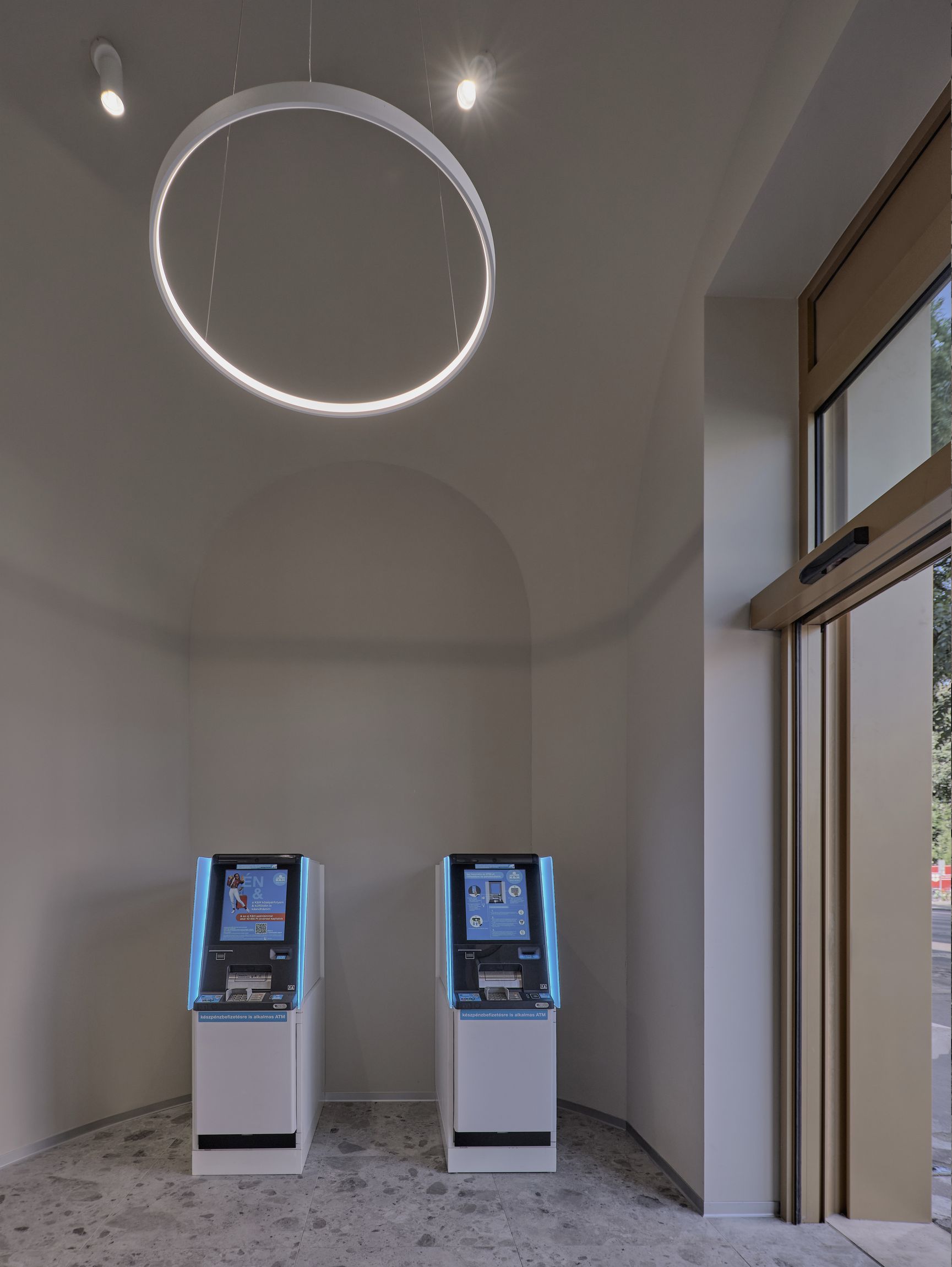
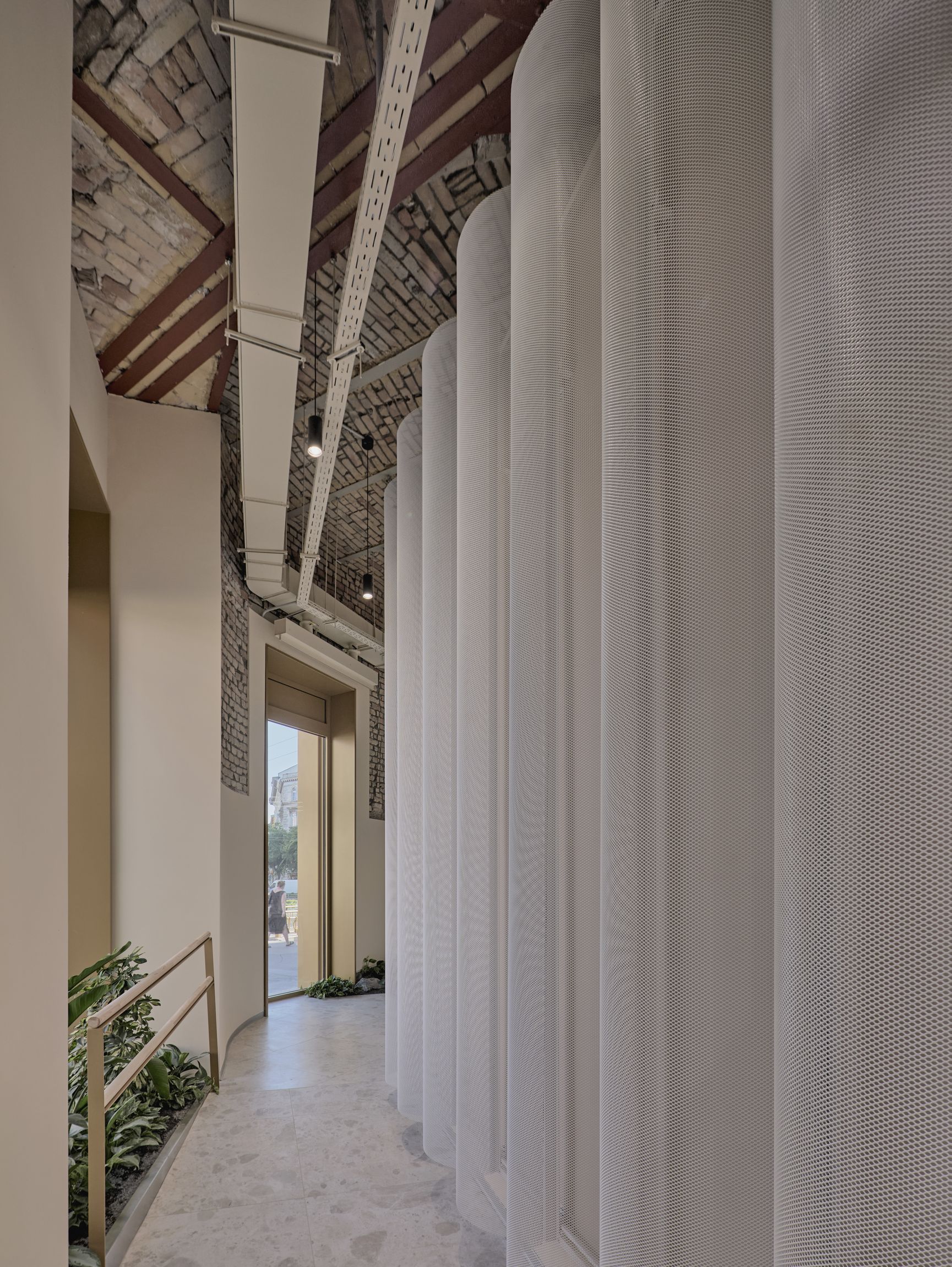
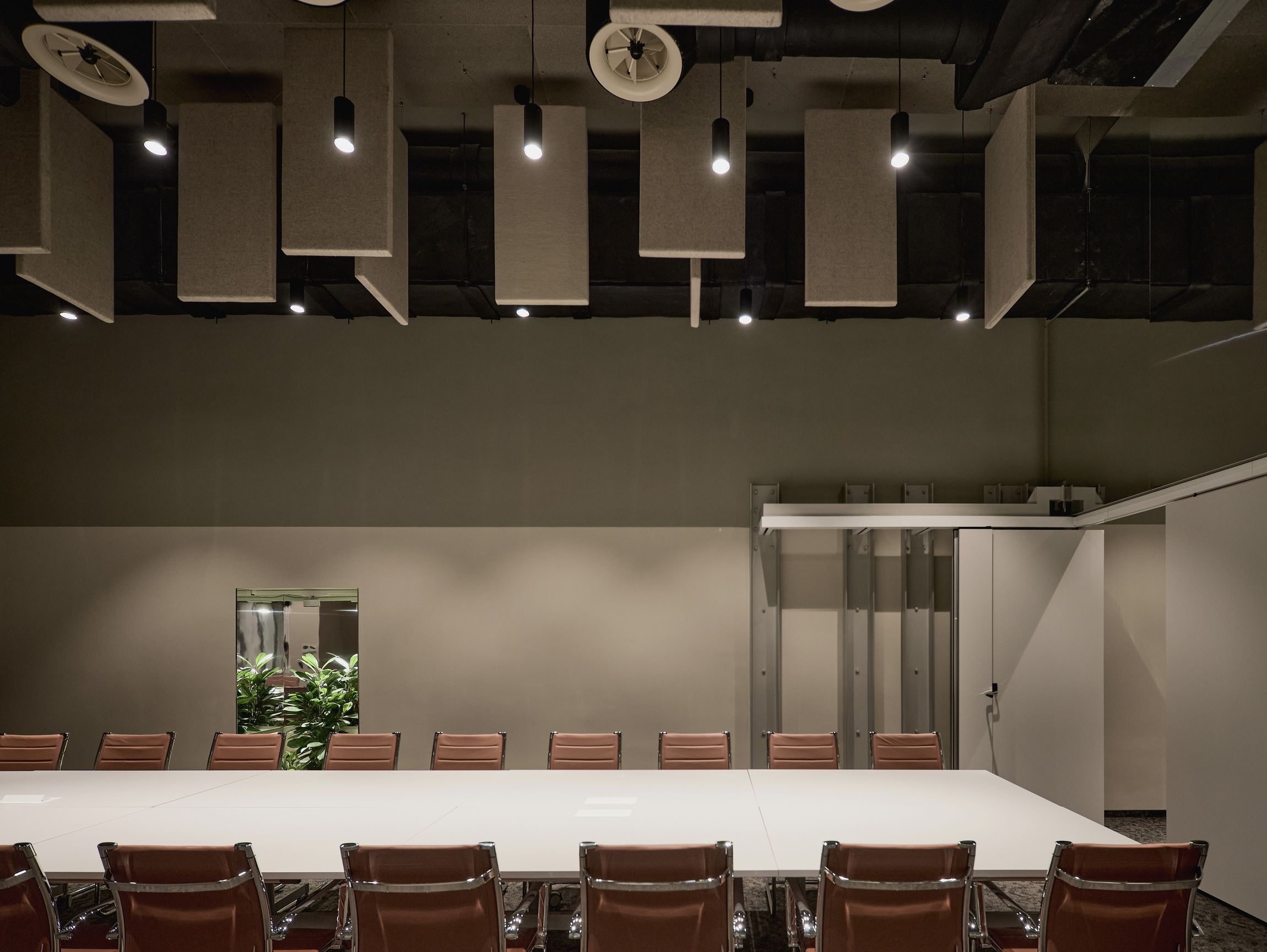
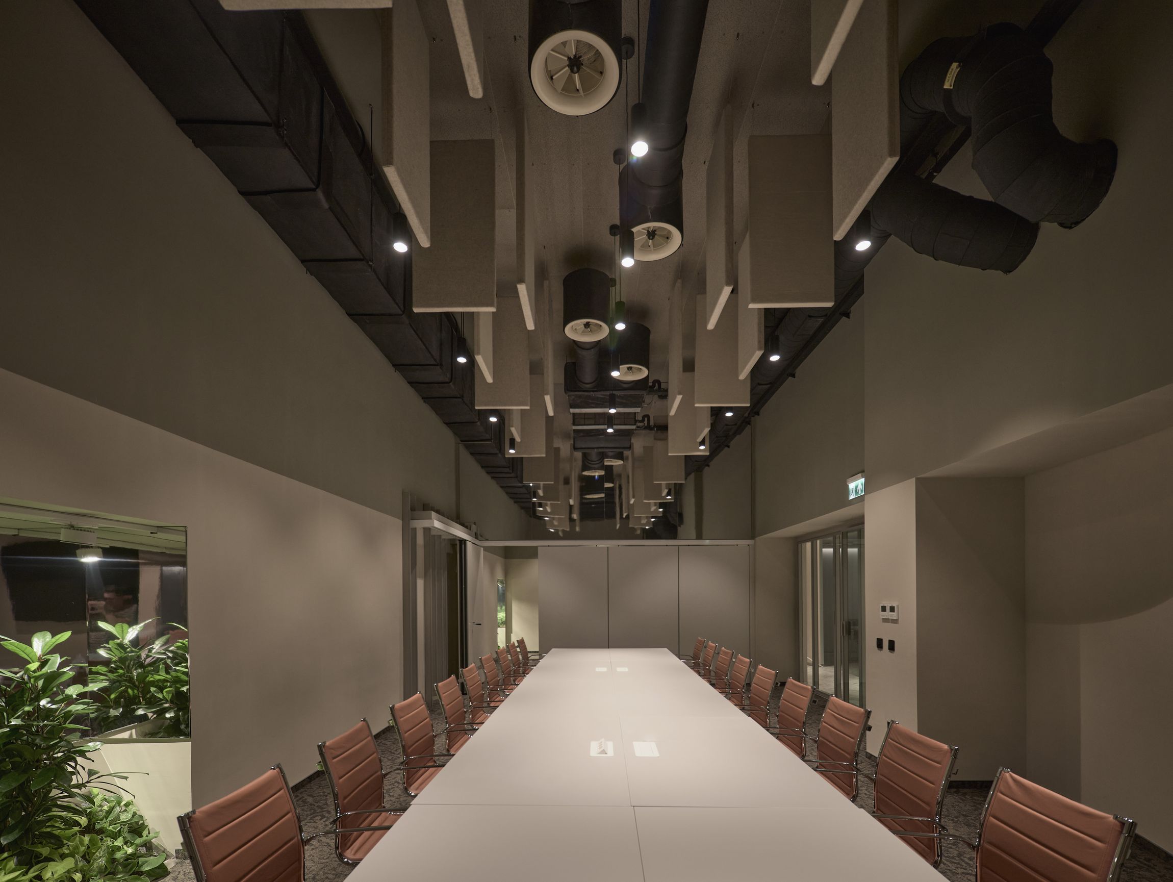
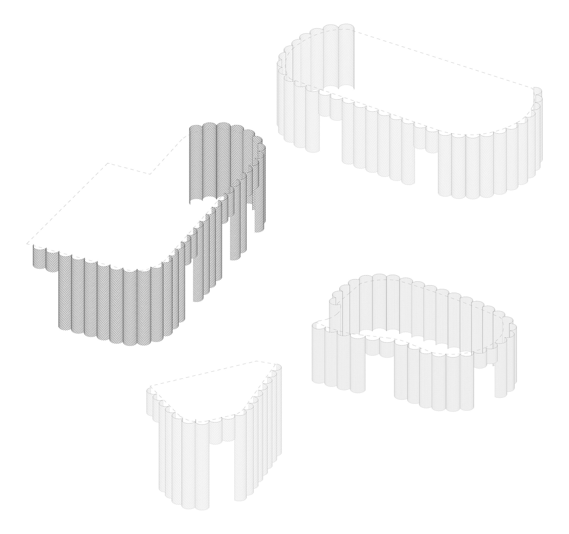
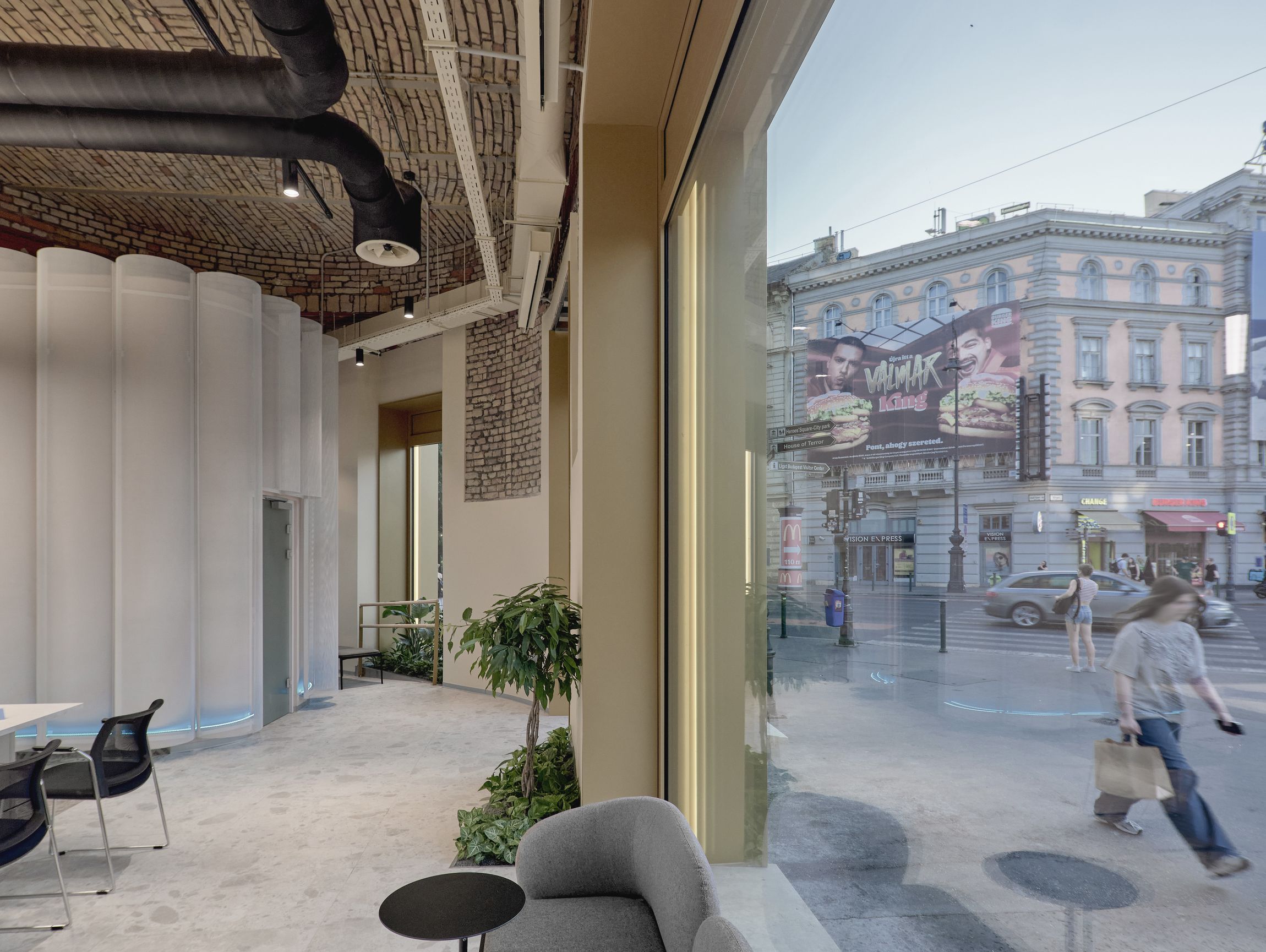
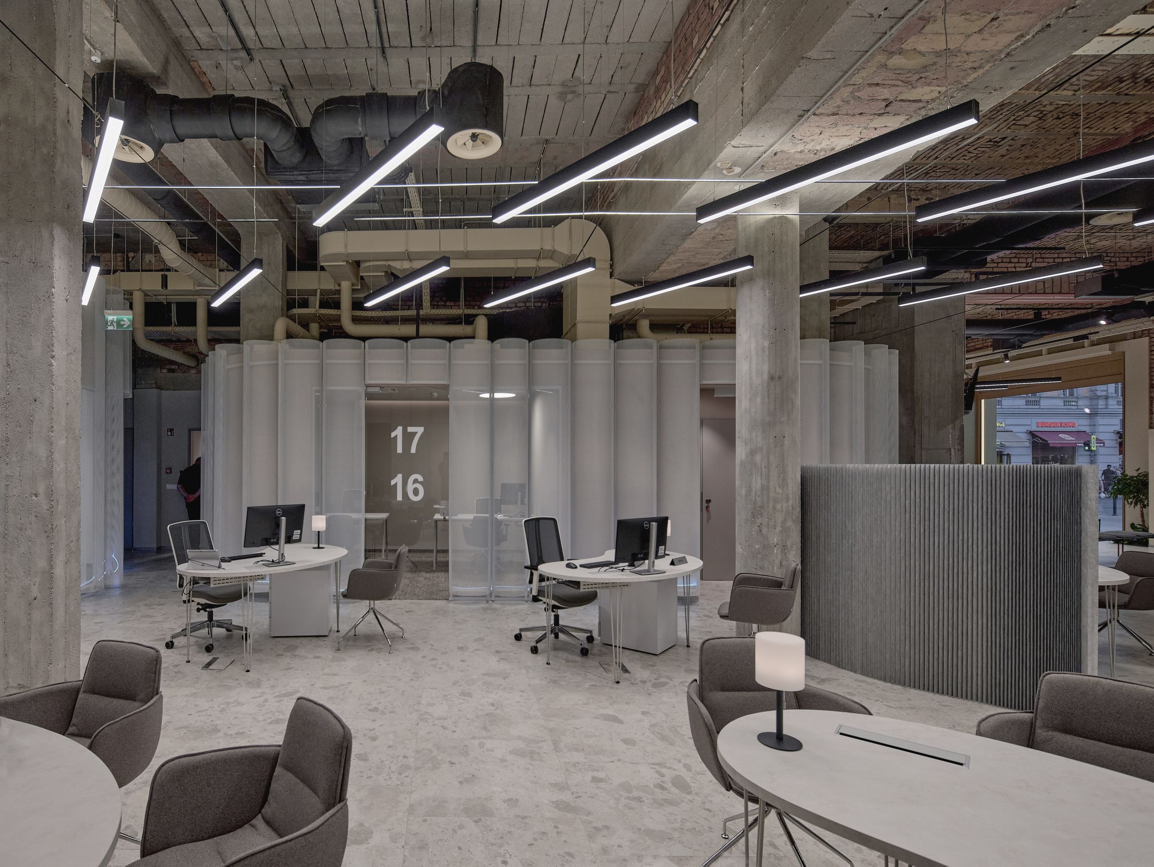
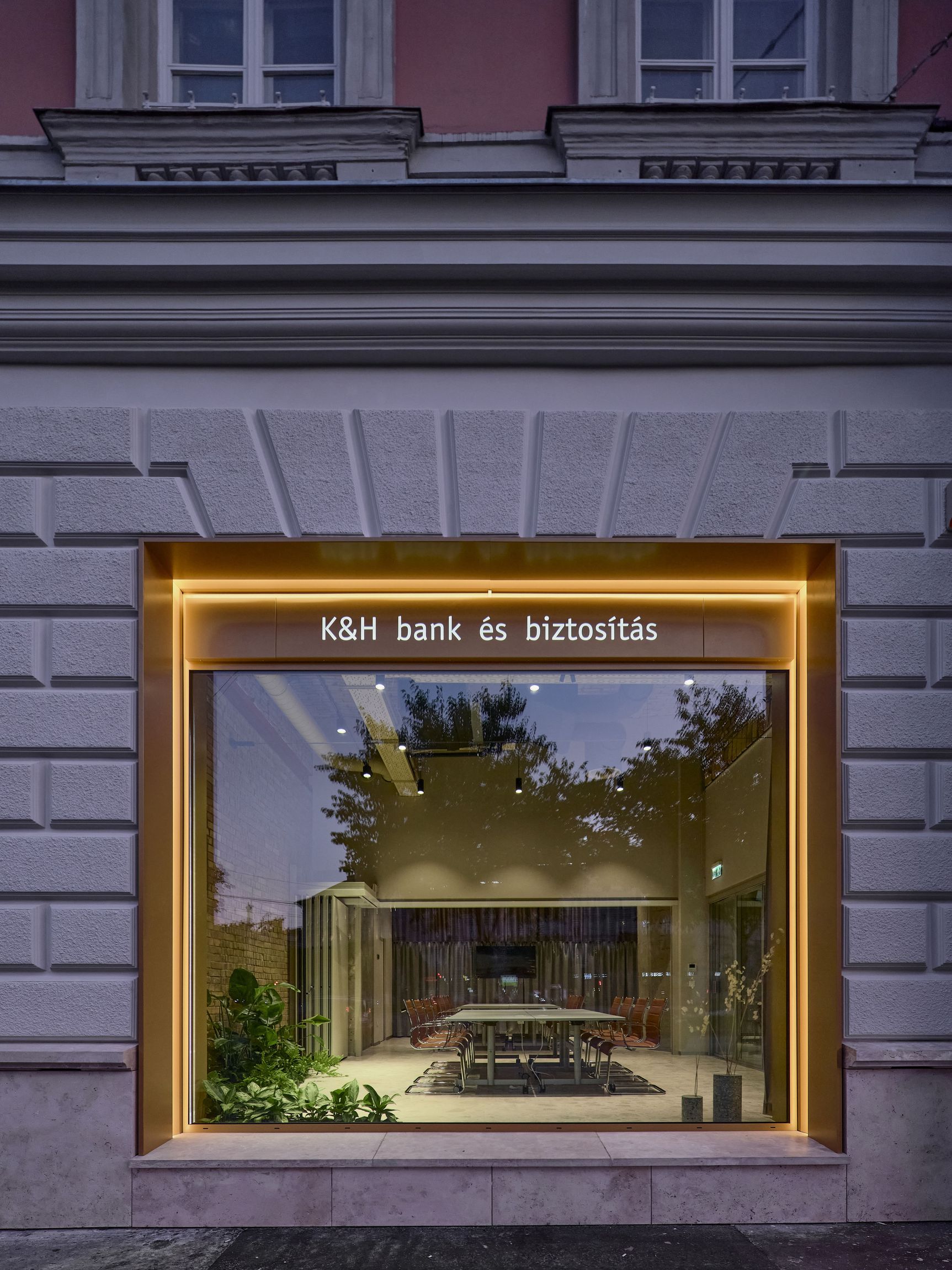
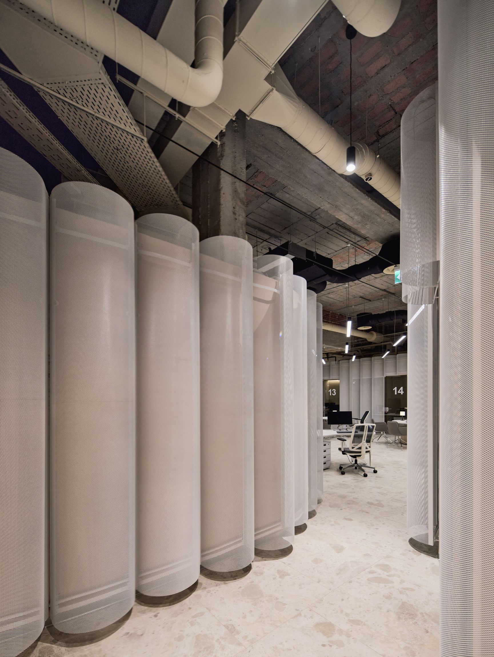
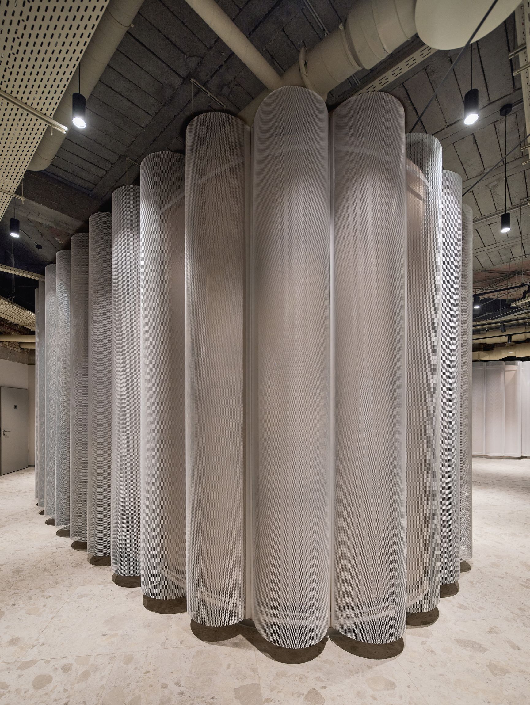
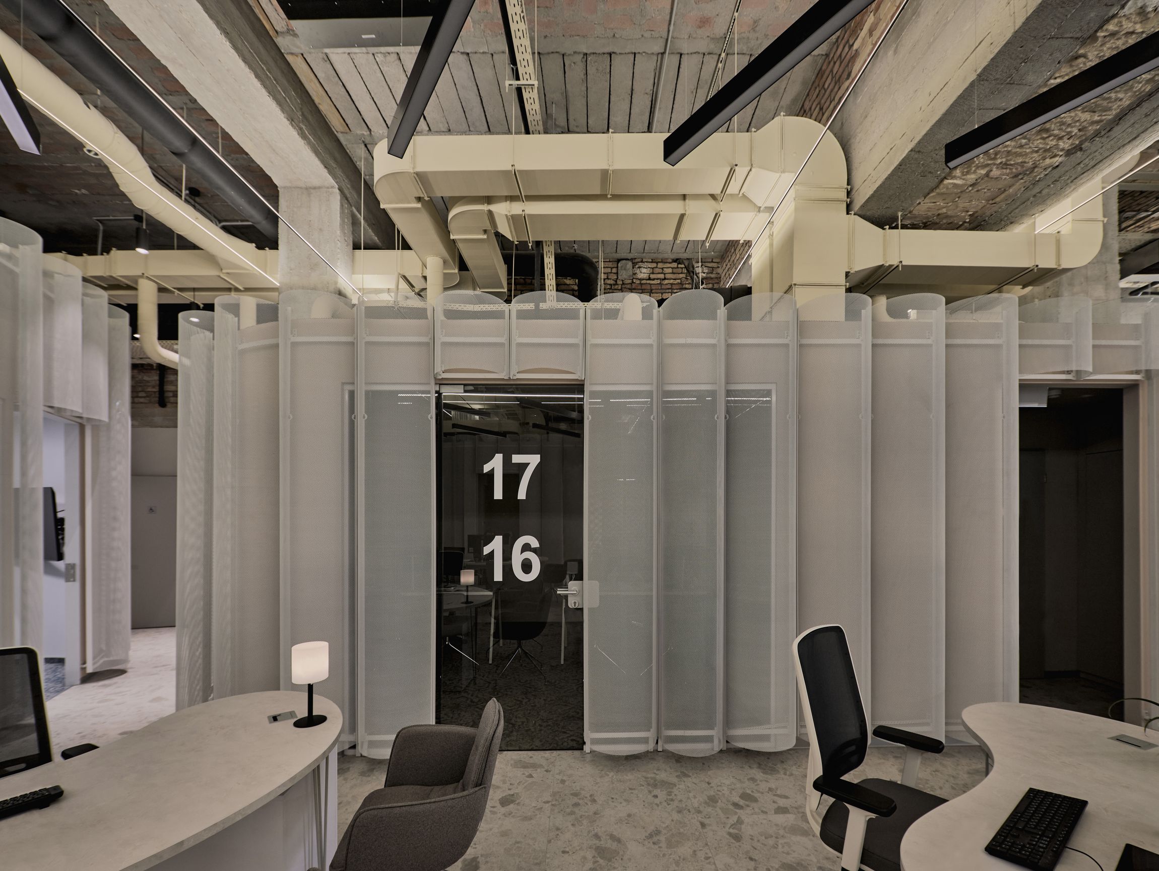
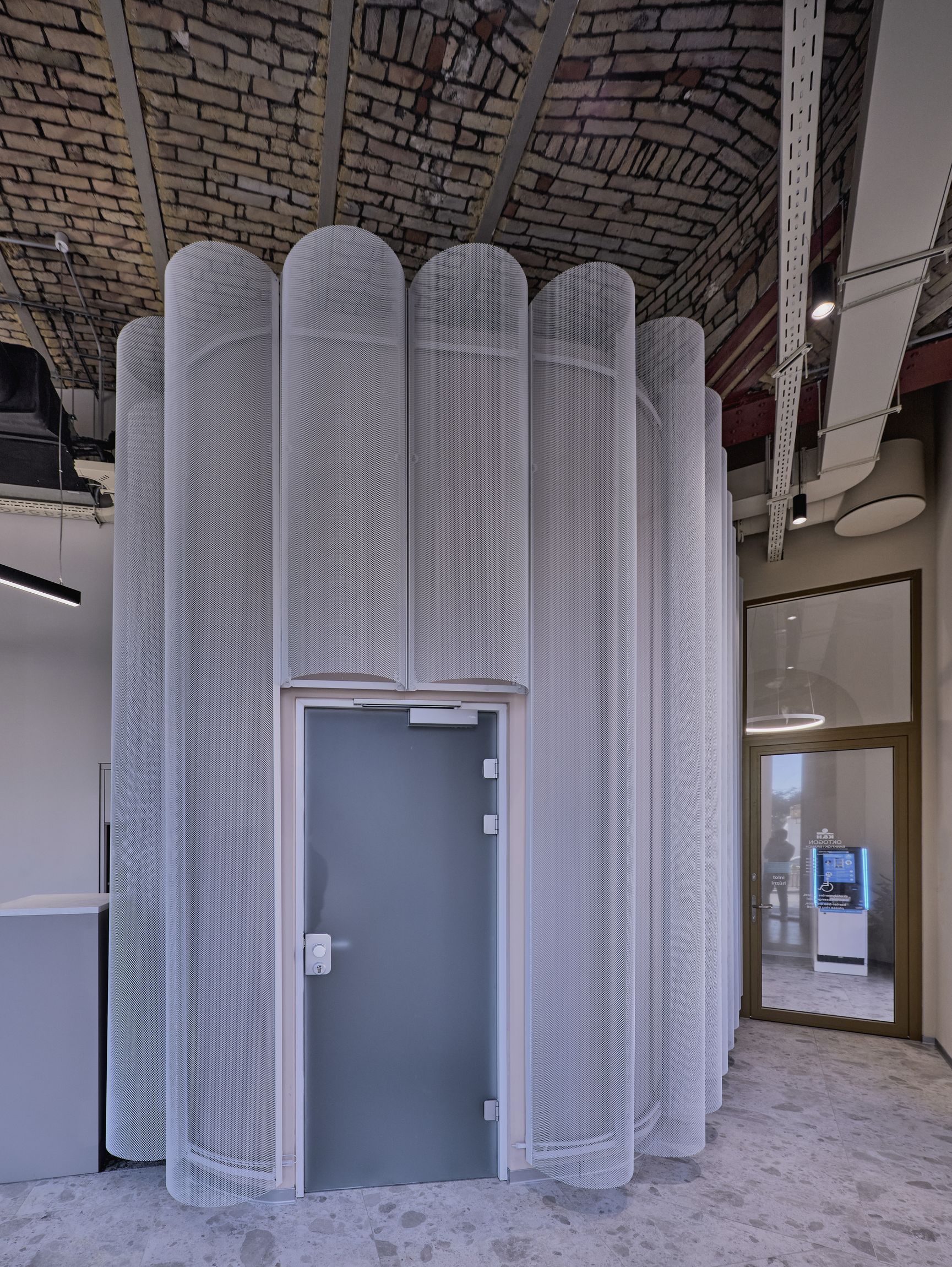
The functions that can’t work in the open space, are built as independent capsules standing freely next to each other. We finished their surface with semicircular expanded metal sheets in a way that they look like curtains separating private spaces in a public area. They are translucent, not transparent.
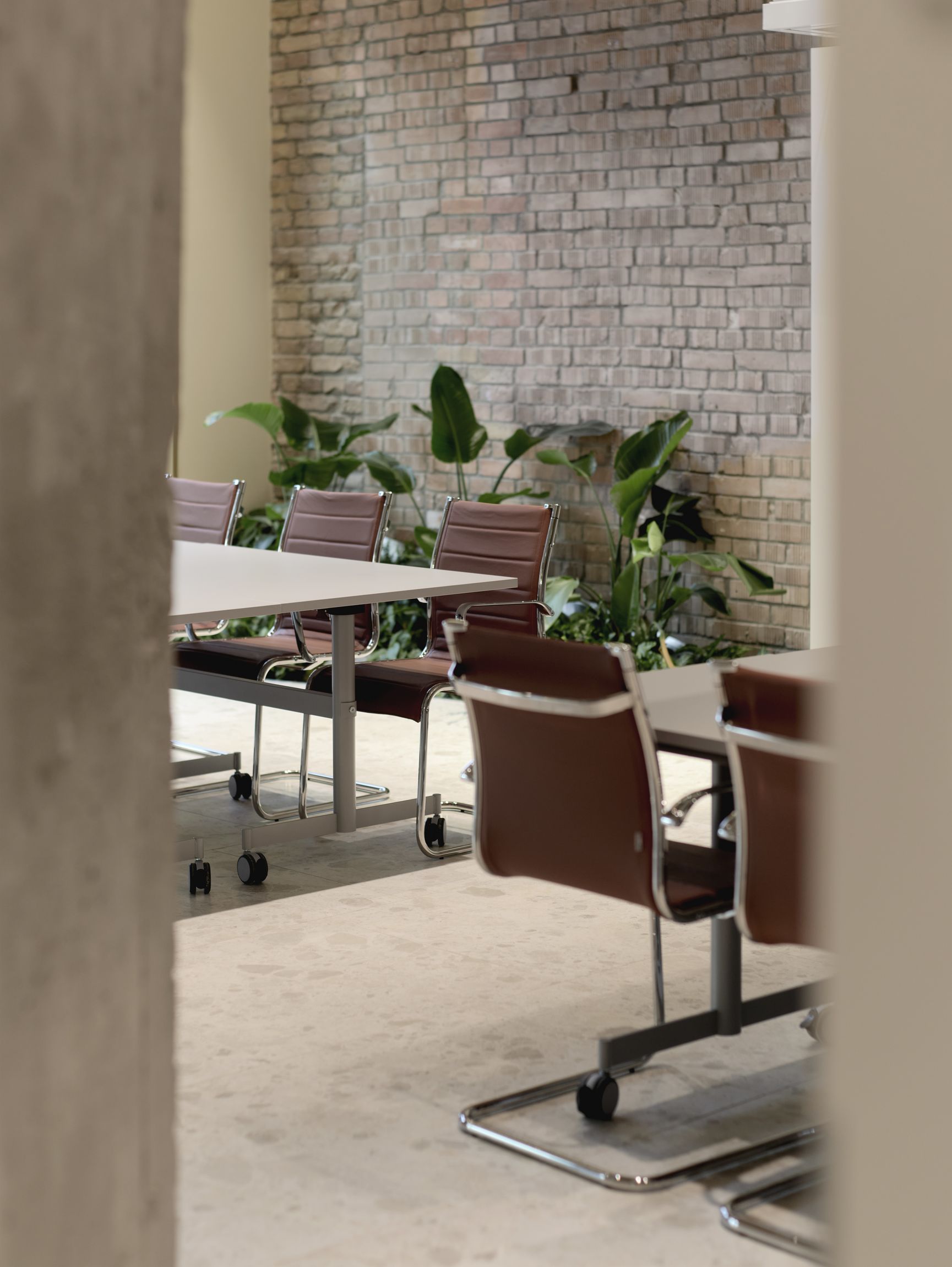
Some enclosed spaces between heavy walls in the rear became rooms that can expand into the main open space, or can be split up into smaller chambers by mobile walls and harmonica glass walls. Their system is also kept visible so the playfulness of the function is showcased.
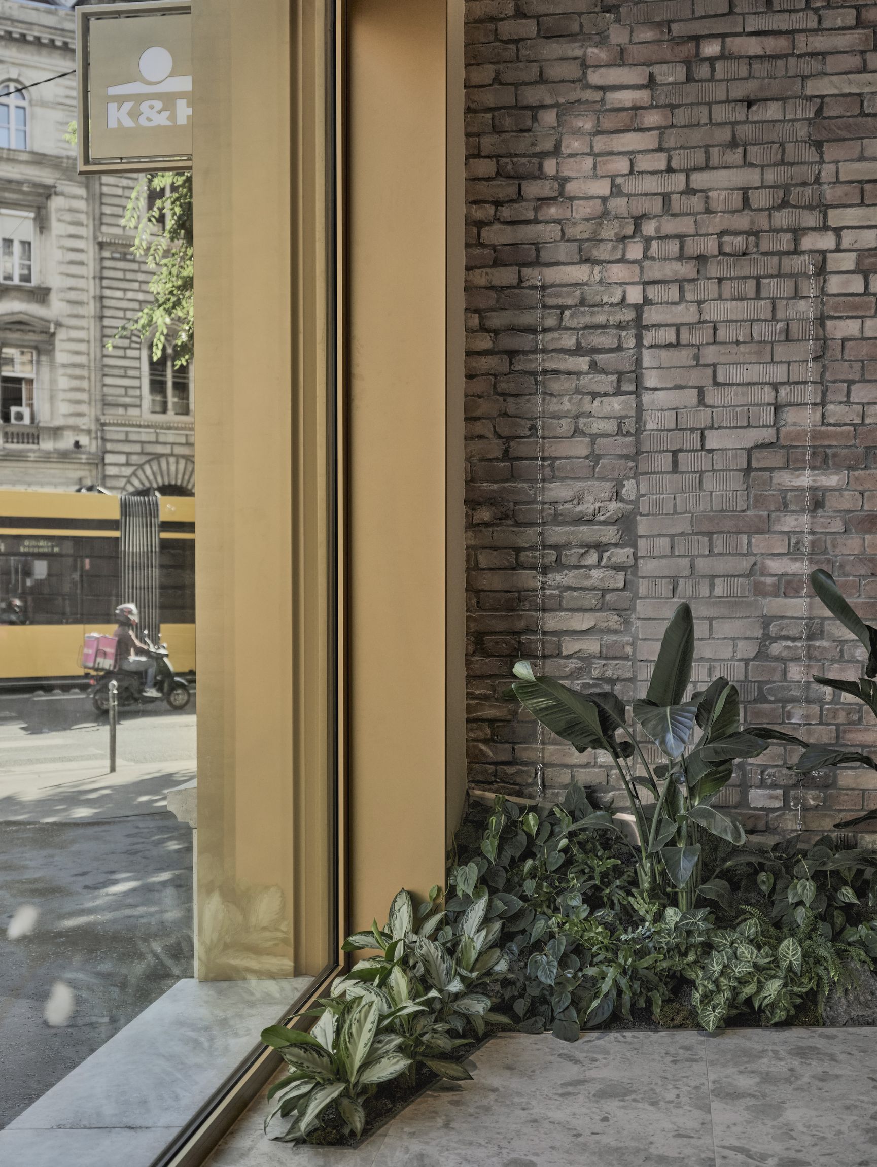
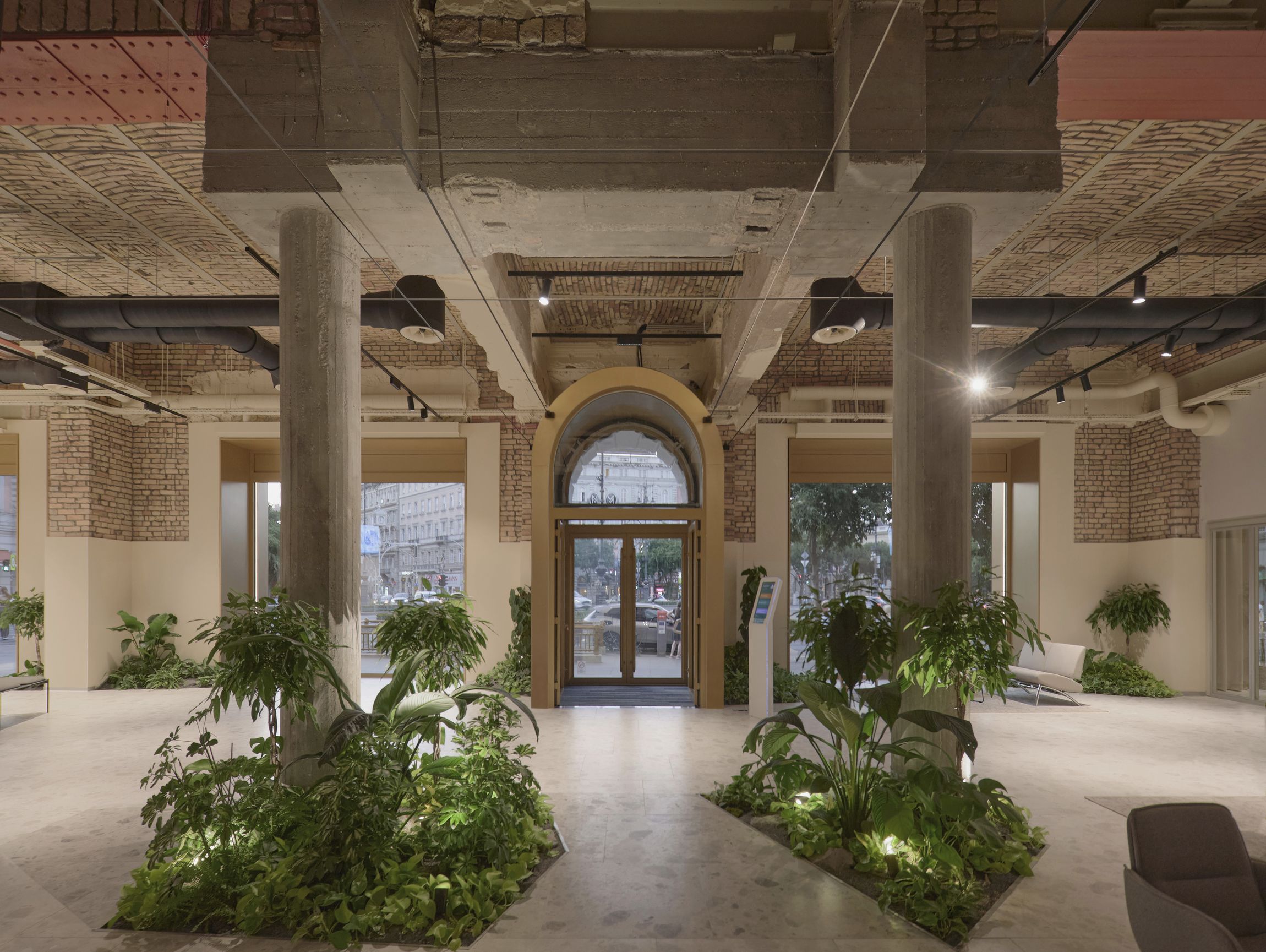
To evoke the Southern Abbazia mood, we used vegetation just as they did it 150 years ago. Except the plants are not kept in containers but planted into the building structure, so they feel more timeless than temporary.
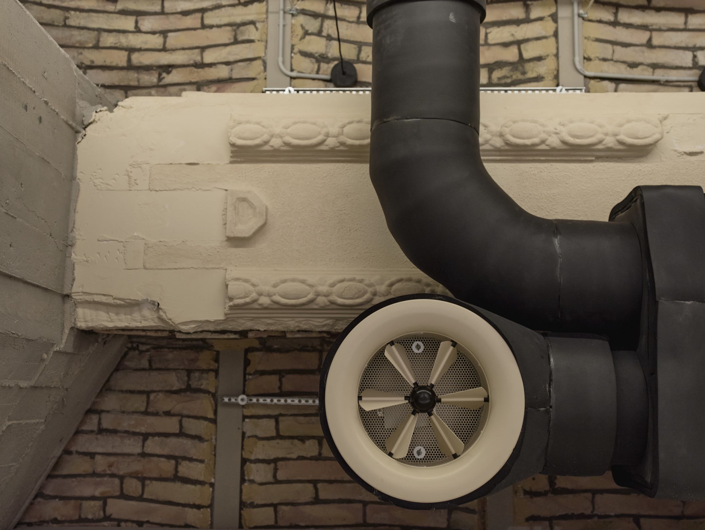
When there was a need for new elements, such as mechanical installations, we were thinking of an integrated composition in shapes and surfaces. The whole design process felt more like being a curator on site, choosing between possibilities of elements to be kept or others to be brought here, a process of thinking, how to combine them to achieve harmony but stay true to the story of the city. We observe the bygone bricklayers’ precise work, we see the strength of the huge concrete posterior beams bearing the past and load of 3 stories above our head, and we can also understand how the fresh air is delivered now to the meeting rooms.
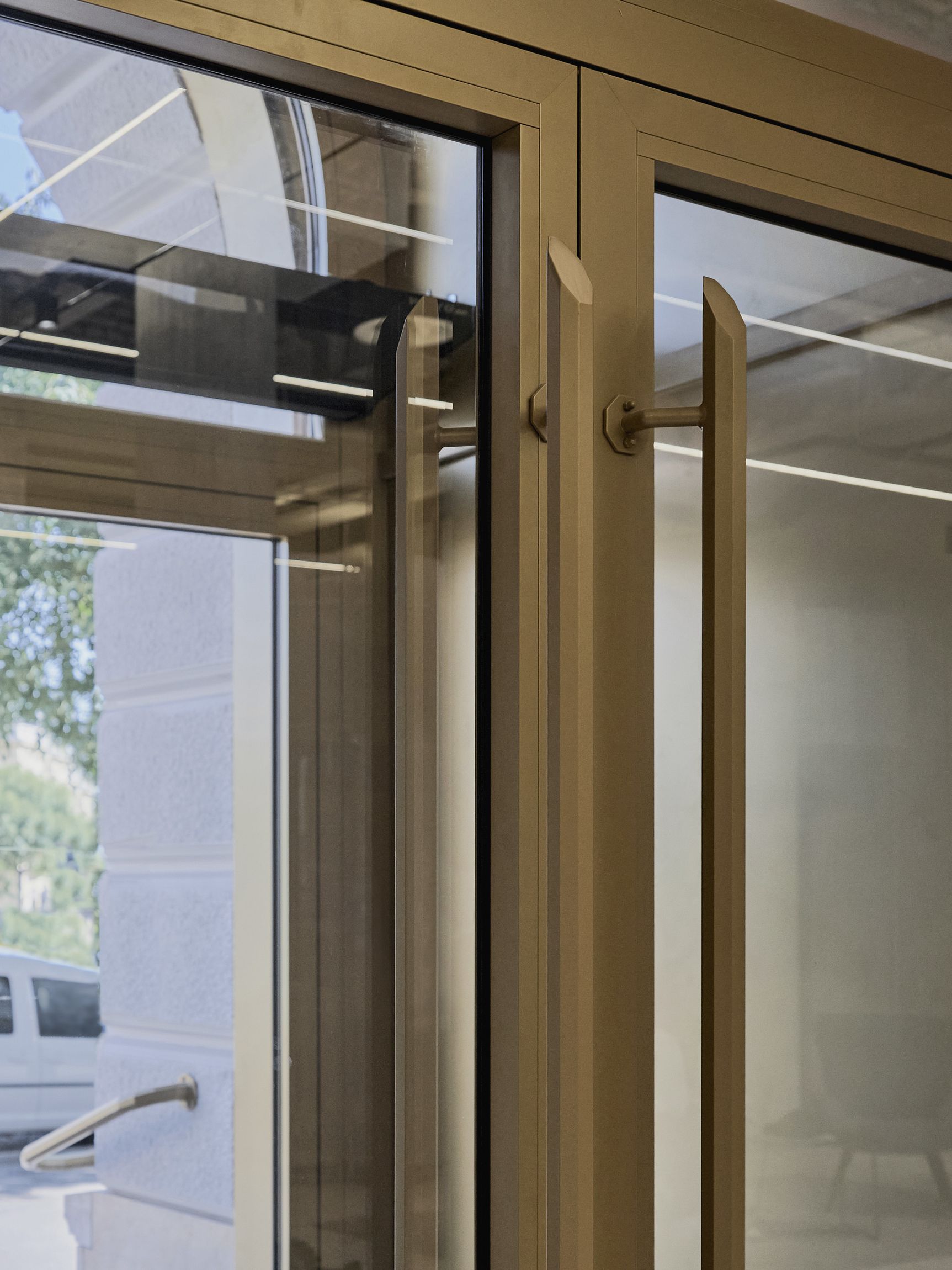
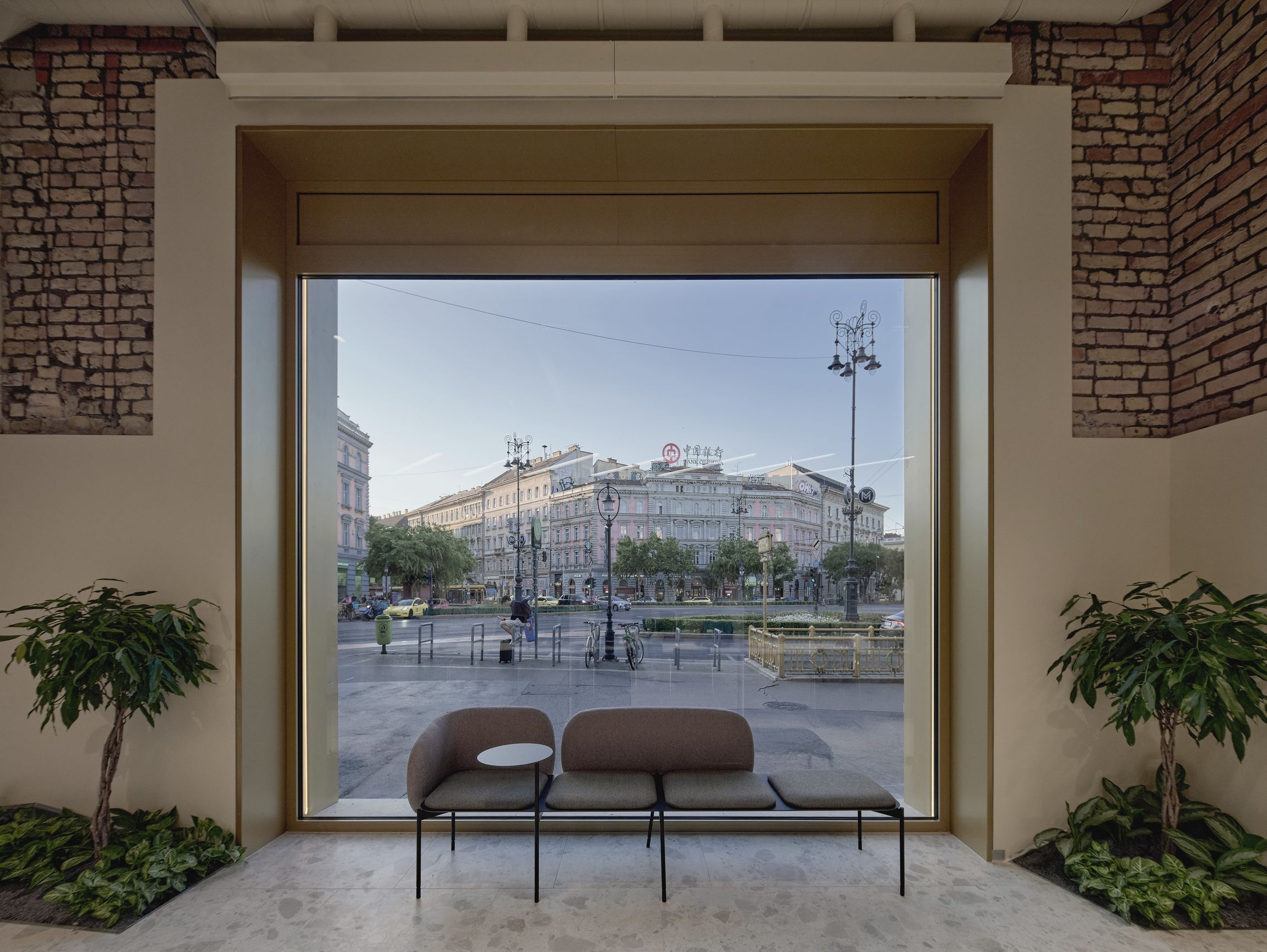
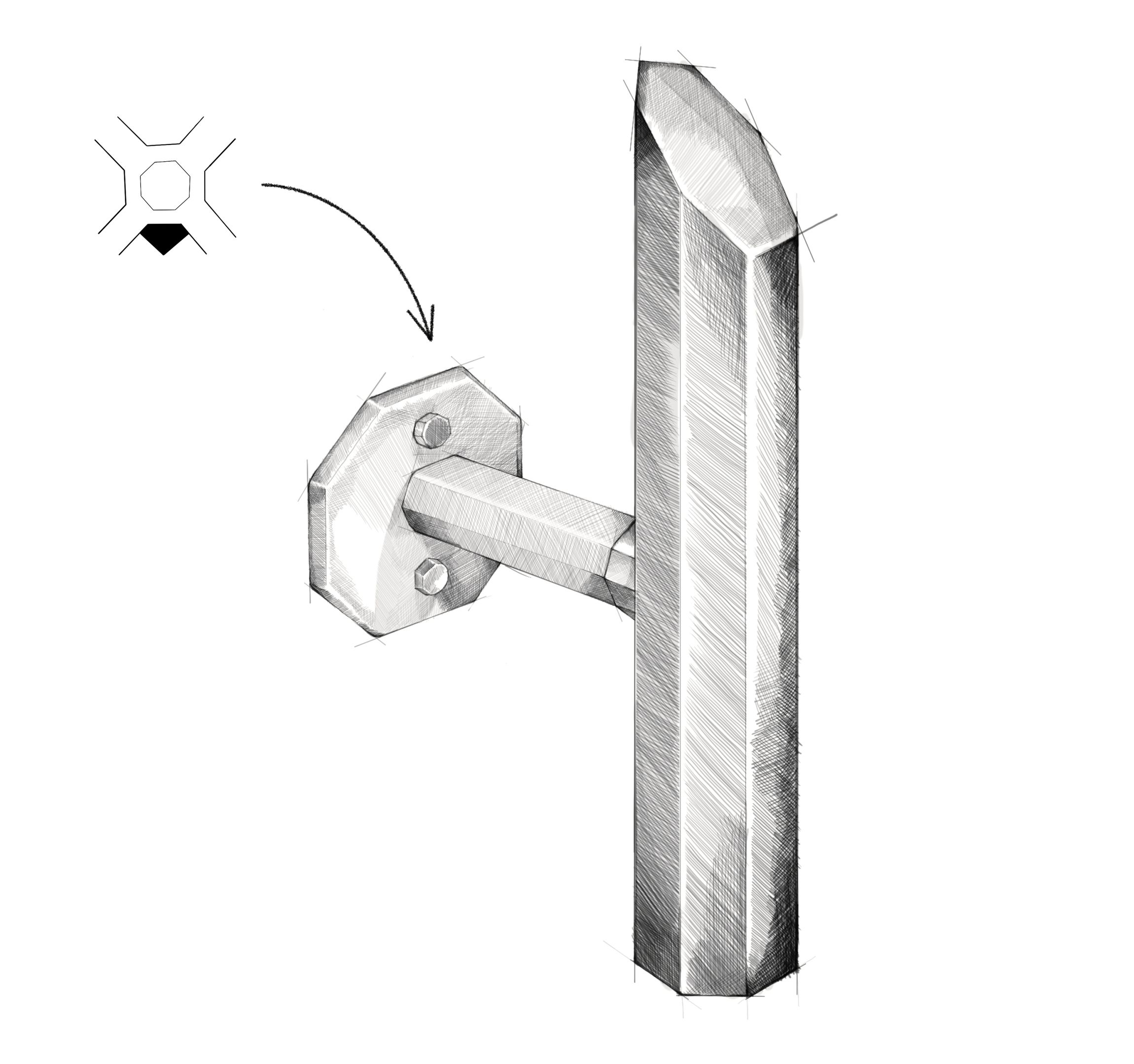
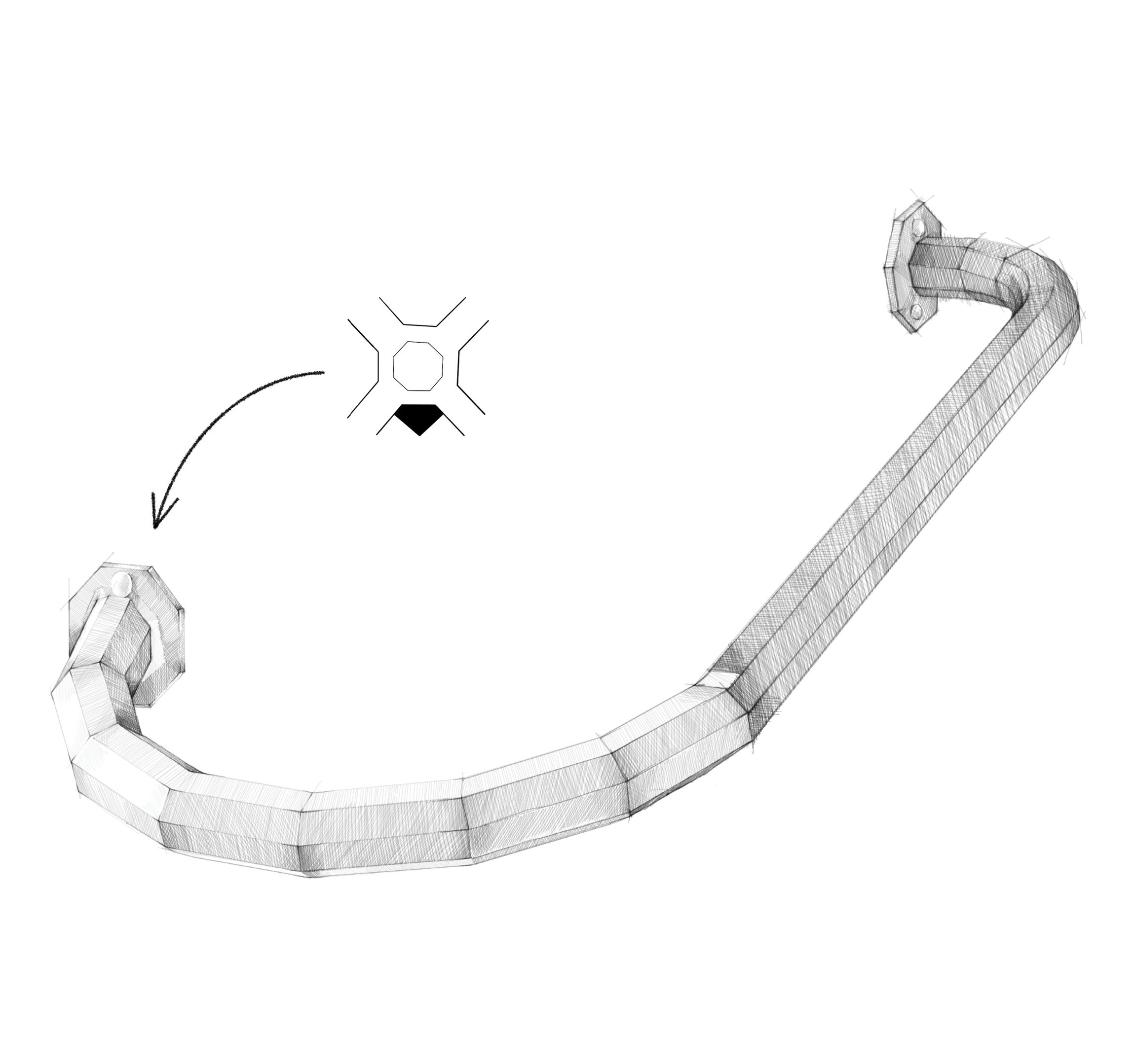
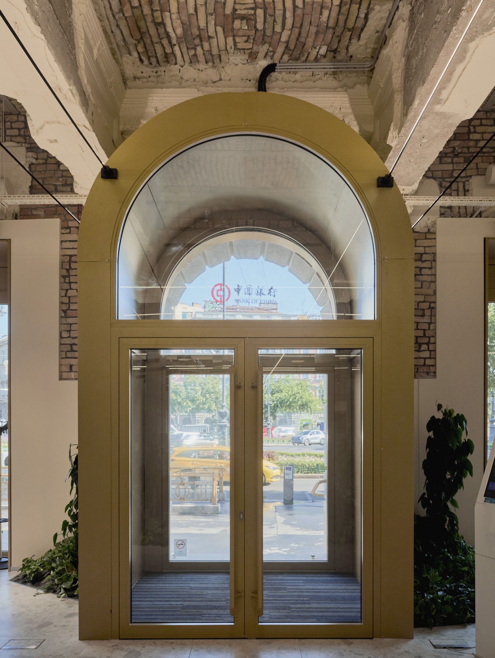
We refurbished the façade in a way that the corners of the square become similar too each other again, and we also reinstalled the original symmetrical composition. We used big glass openings without divisions as large as much it is technically possible – to blur the border between the street and the bank branch, to be more inviting towards the interior, and to be more integrated into the city. We framed the large windows with illuminated golden finish that reflects on the luxury shops of Andrássy avenue, and on the bank as well. We used octagonal geometry to shape the section of the handle and the railing at the main entrance, and for the edges and engraving of the stone surfaces of the stairs.